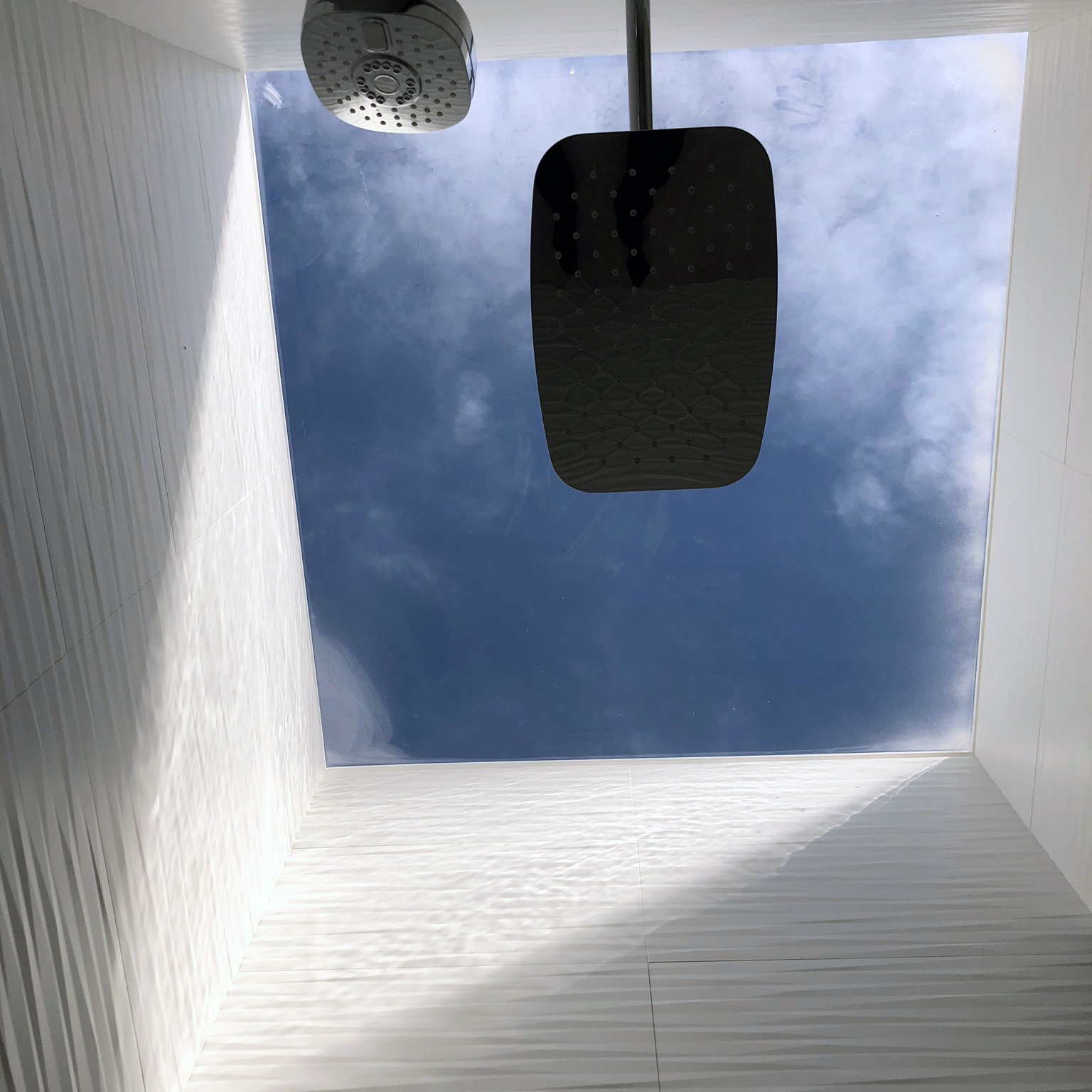
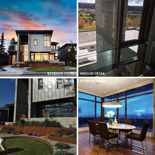
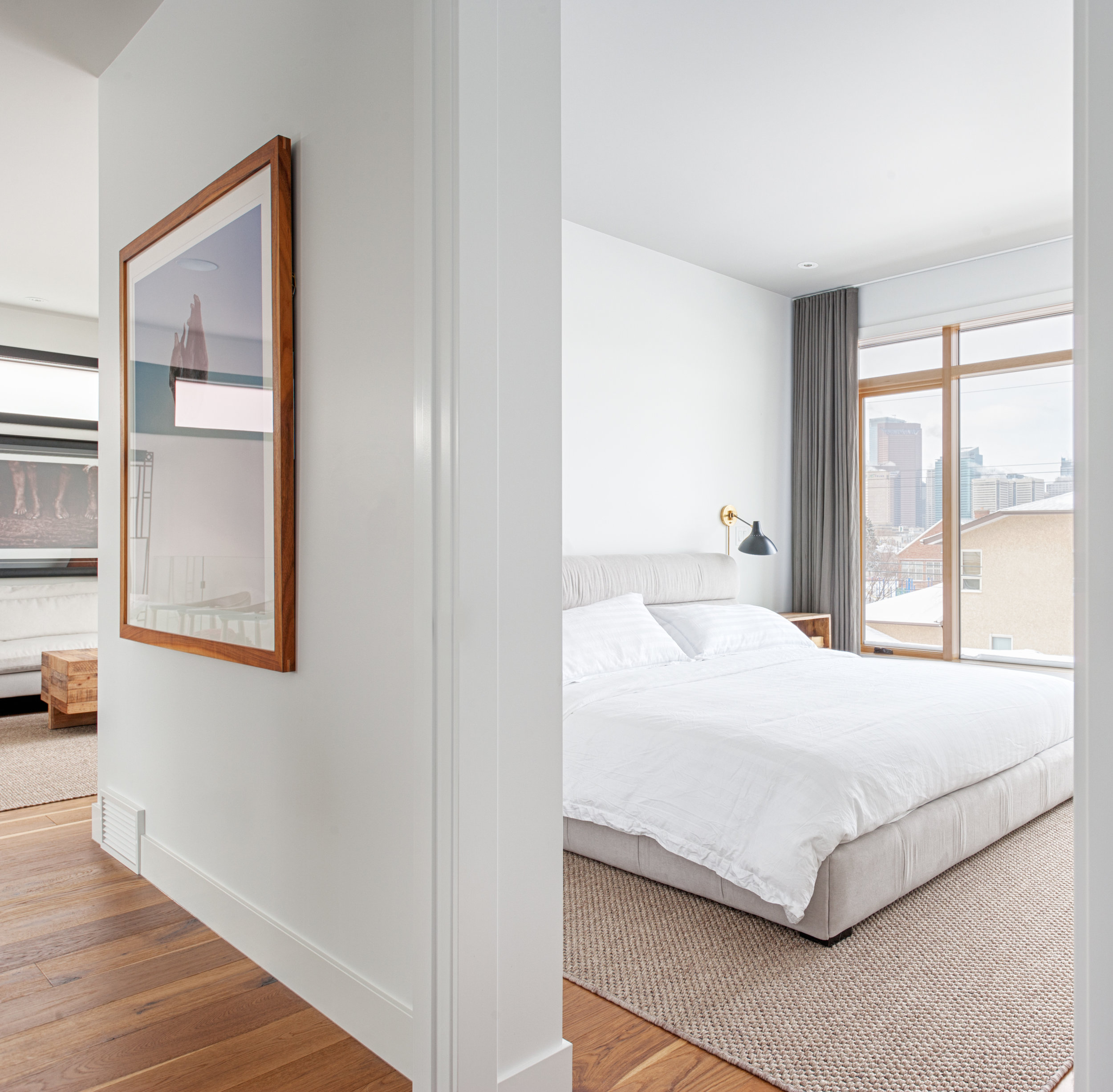
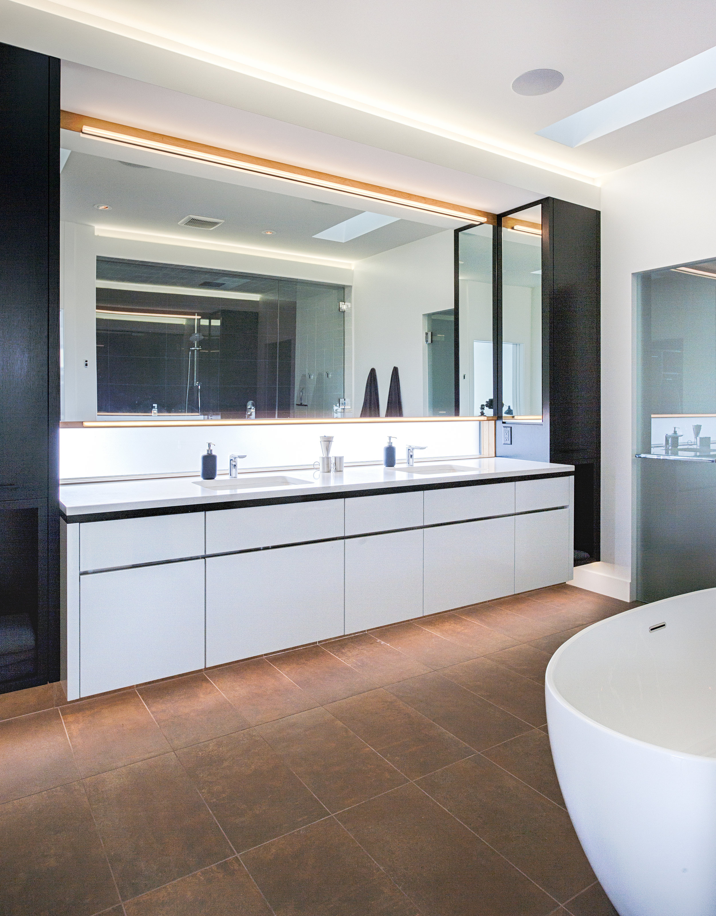
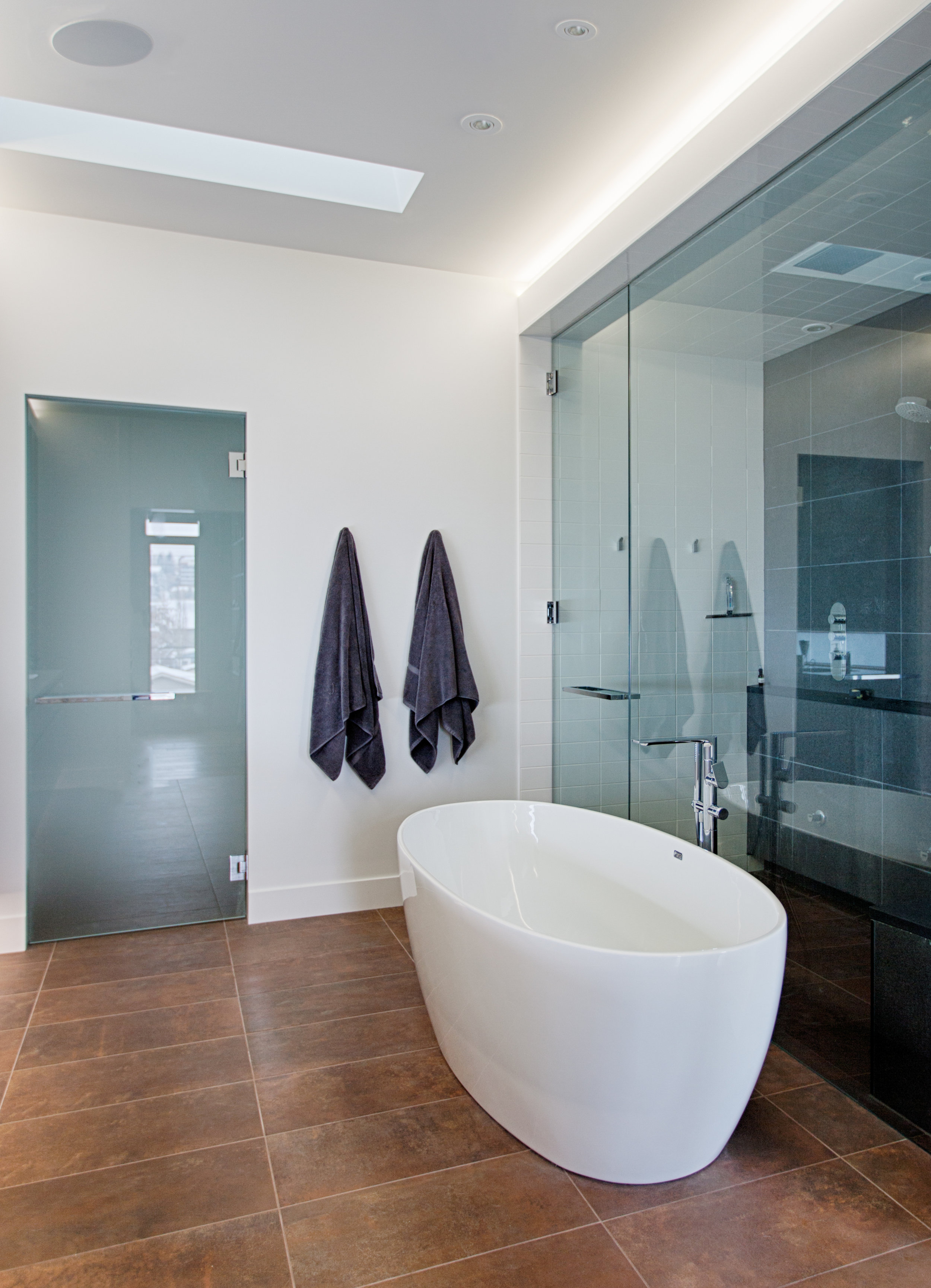
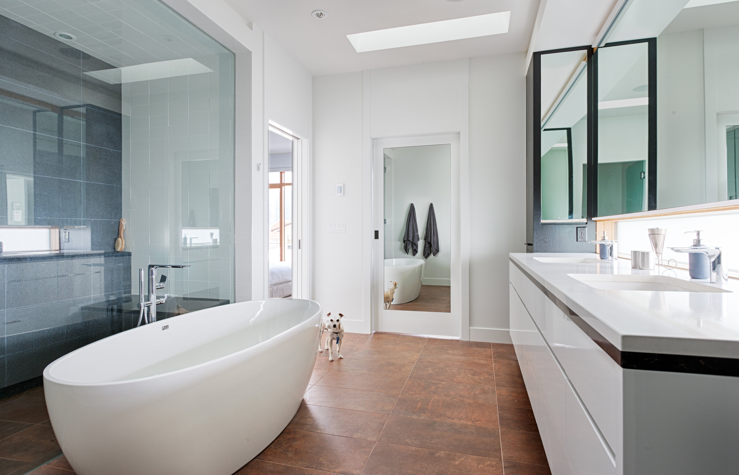
Last night we had the opportunity to visit our Stanley Drive house as it is nearing completion. This house features a window wall as wide as the house with spectacular downtown views over Stanley Park. The master bath has a very well executed seamless skylight that drenches the shower in sunlight. We can't wait to see it once it's finished!
Secondary Suites Become Discretionary in R-1, R-C1, and R-C1L Districts
Calgary has been behind most of the country in streamlining the process for the approval of basement suites and backyard suites in single-family districts. But, as of yesterday, this has changed. City Council voted 9-6 in favour of making suites a discretionary use in the R-1, R-C1 and R-C1L districts. This means that people who own a property with this designation will no longer require a land use redesignation, or the associated public hearing, to apply to build a suite. The process will be an administrative one, meaning that people will simply need to apply for a development permit.
We're particularly excited to be able to help provide laneway houses—another term for backyard suites—to the many Calgarians who want them but were daunted by the previous onerous process.
Yes! Yes yes yes yes yes yes! Thanks to council for having the courage to stand up for the right of all citizens to have a safe and decent place to live. https://t.co/qhJ3RILEka
— Naheed Nenshi (@nenshi) March 13, 2018
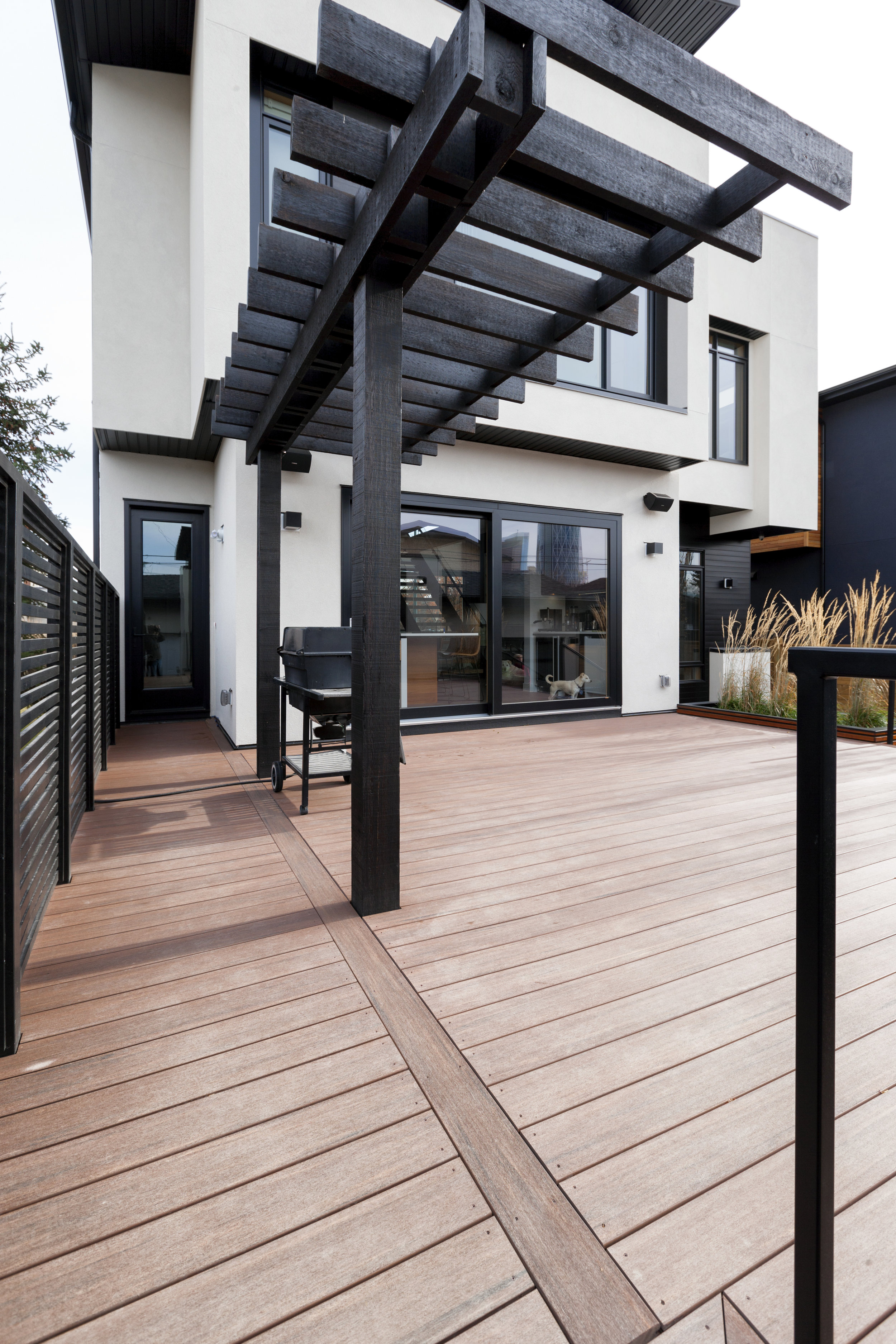
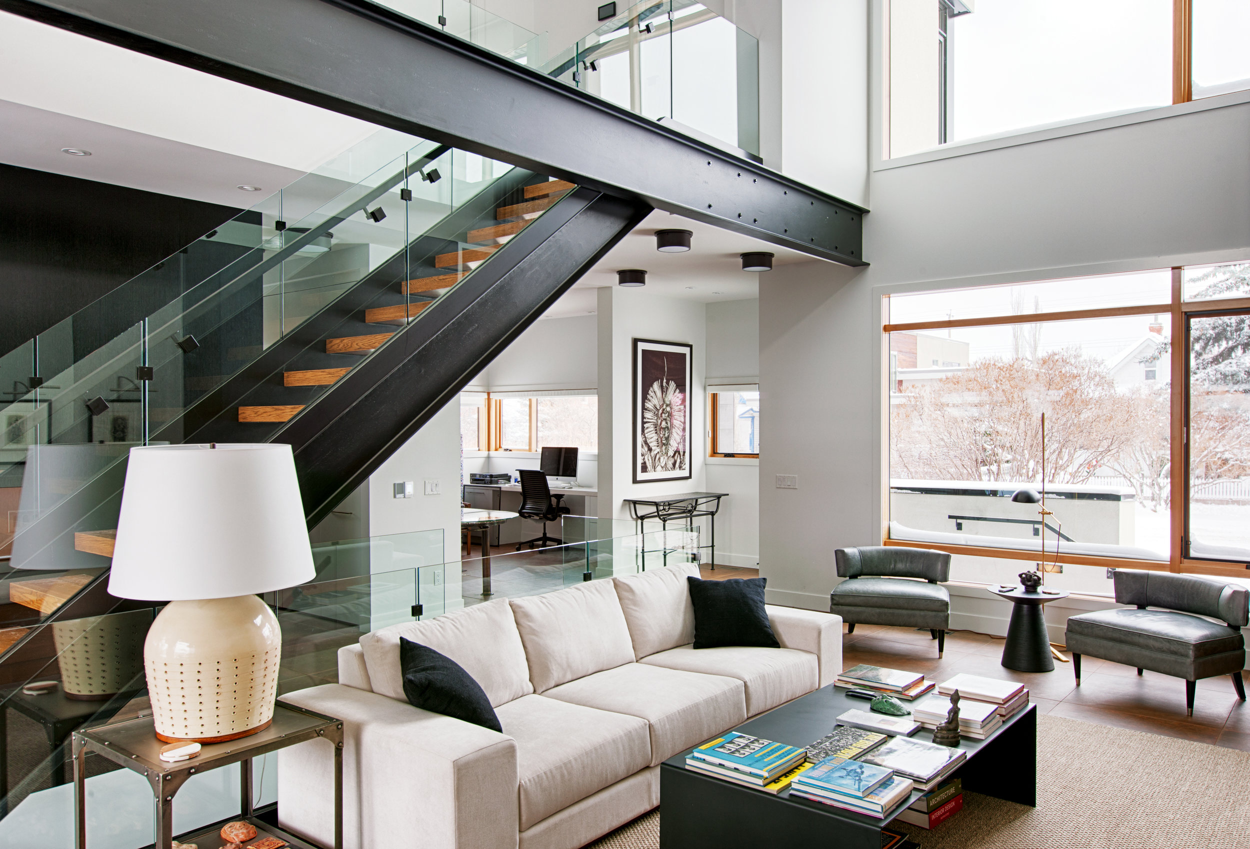
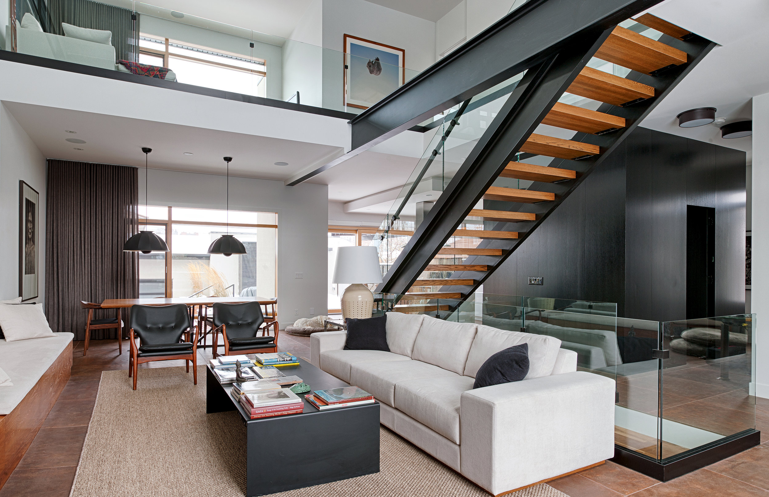
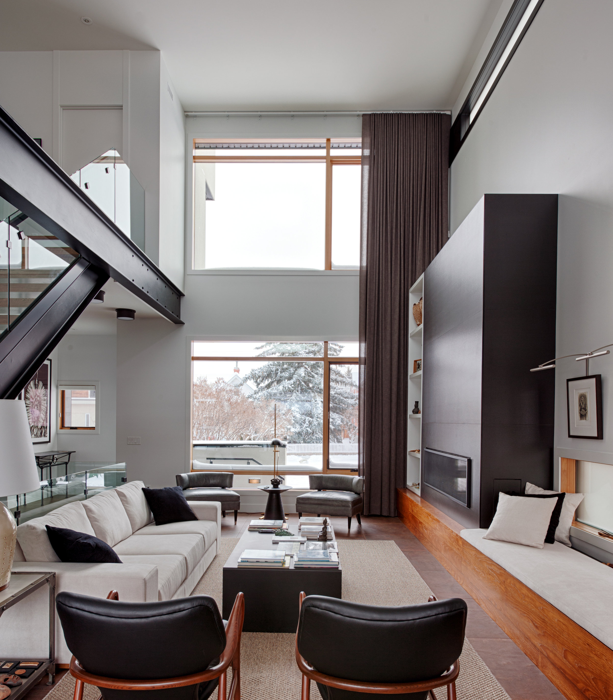
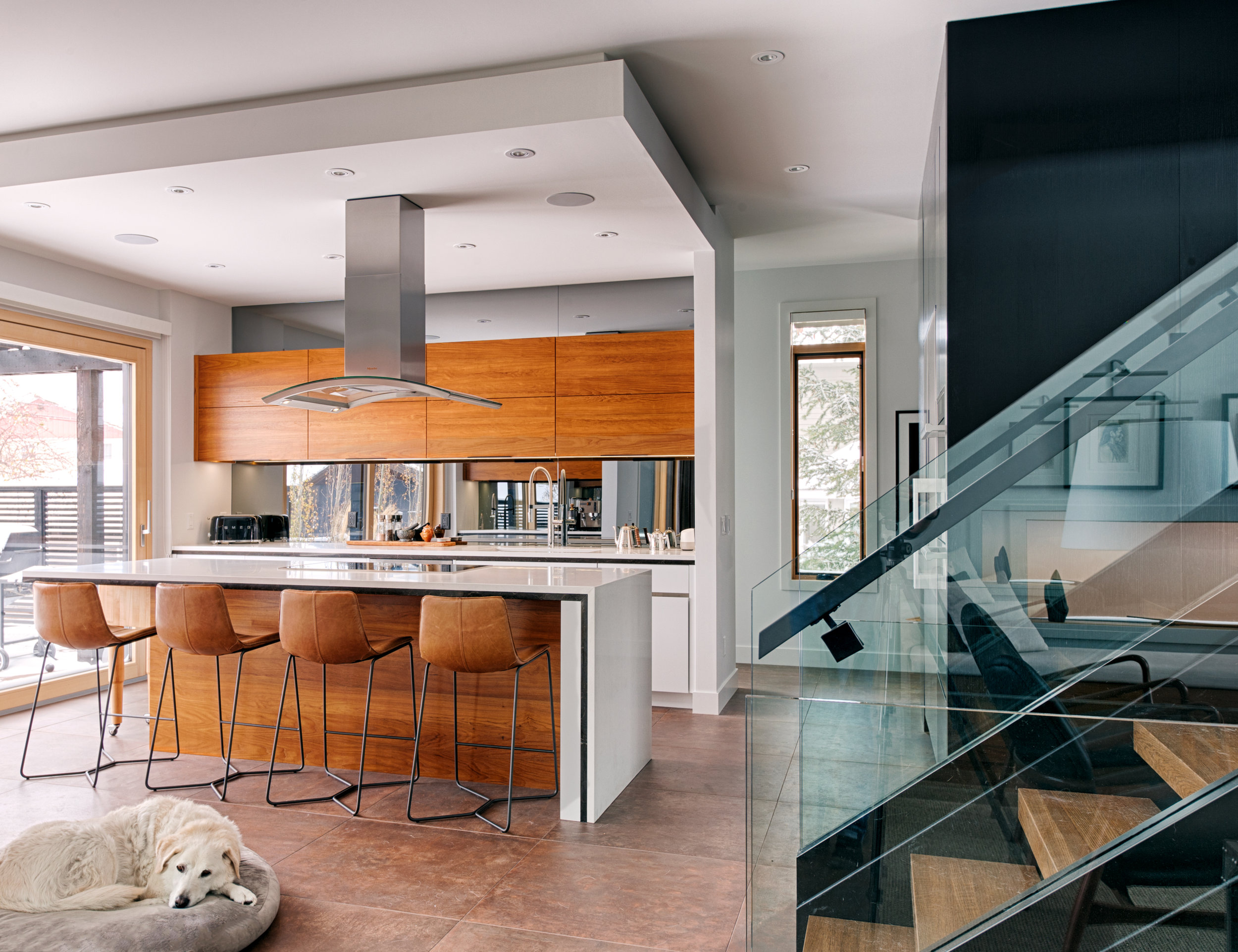
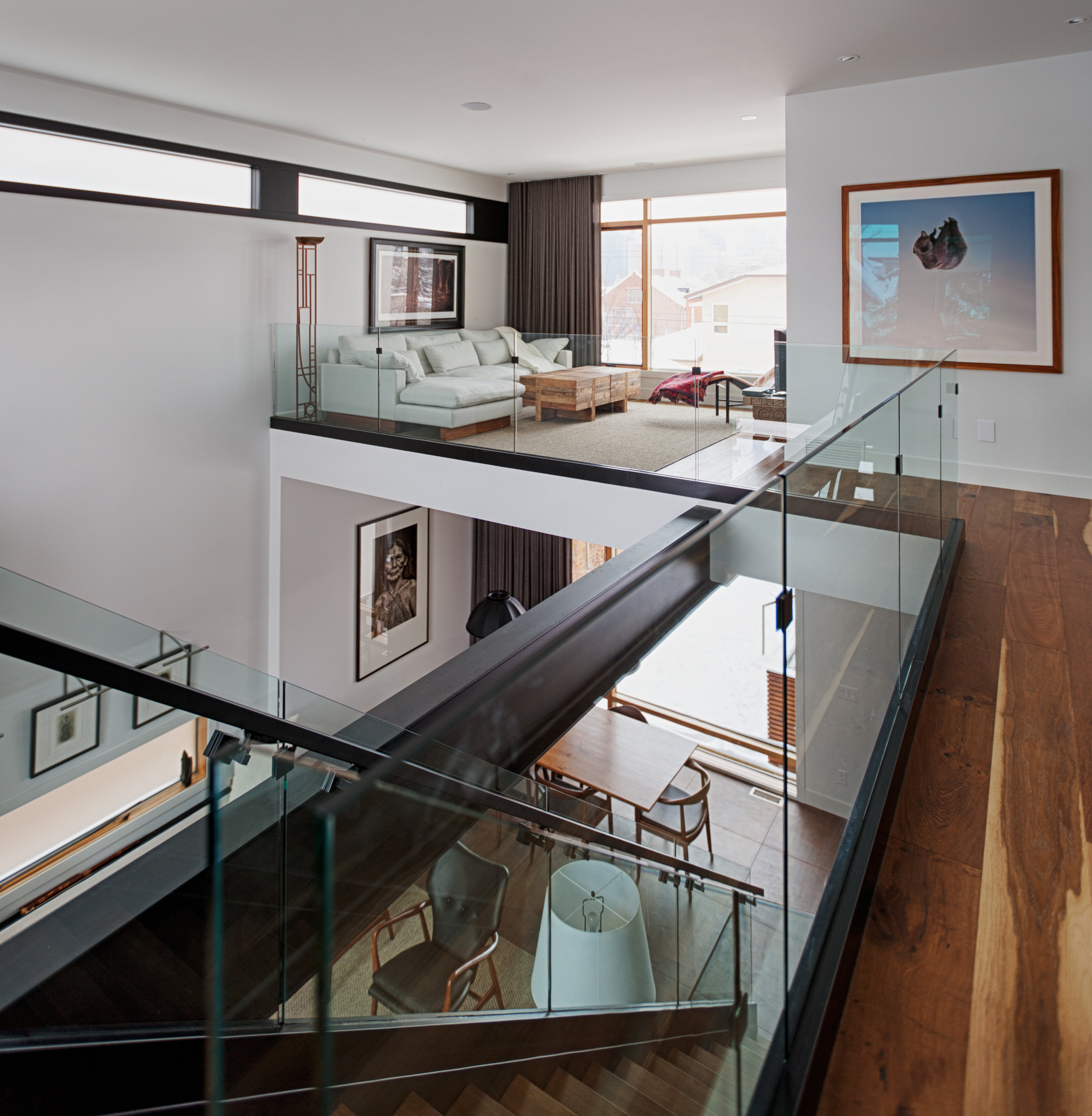
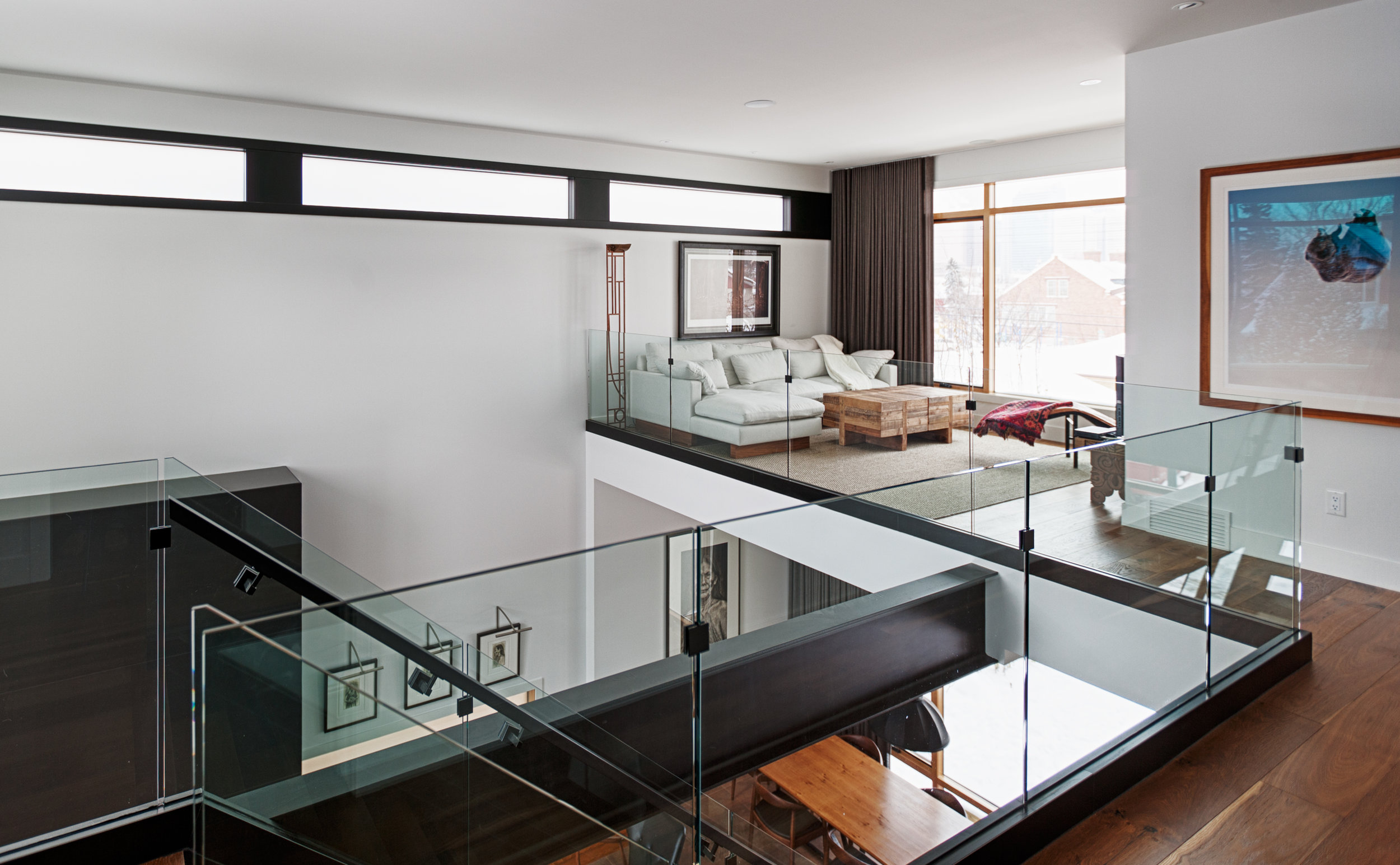
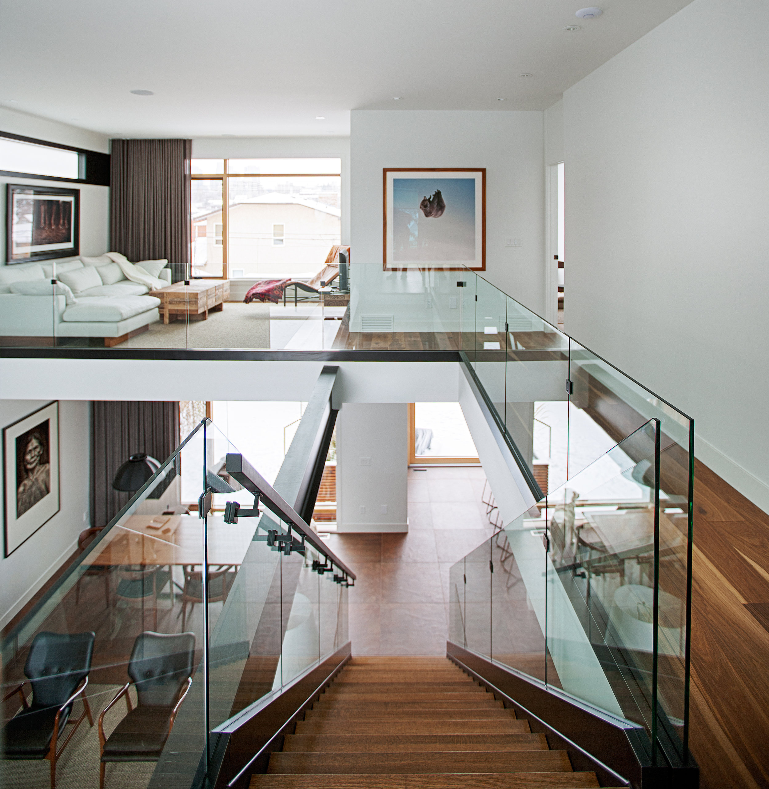
Bridgeland House
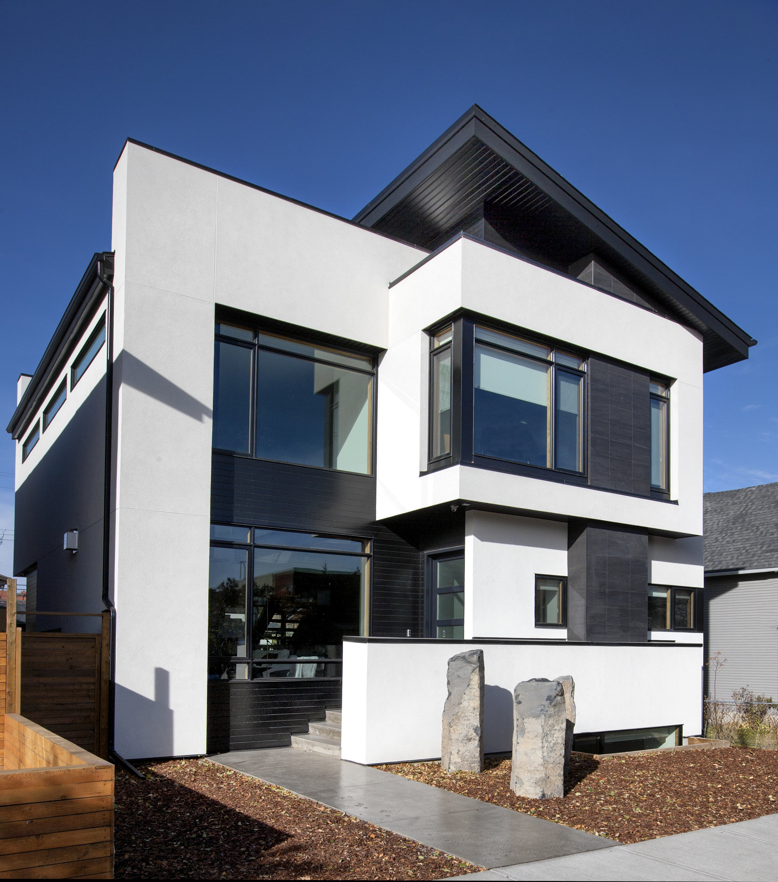
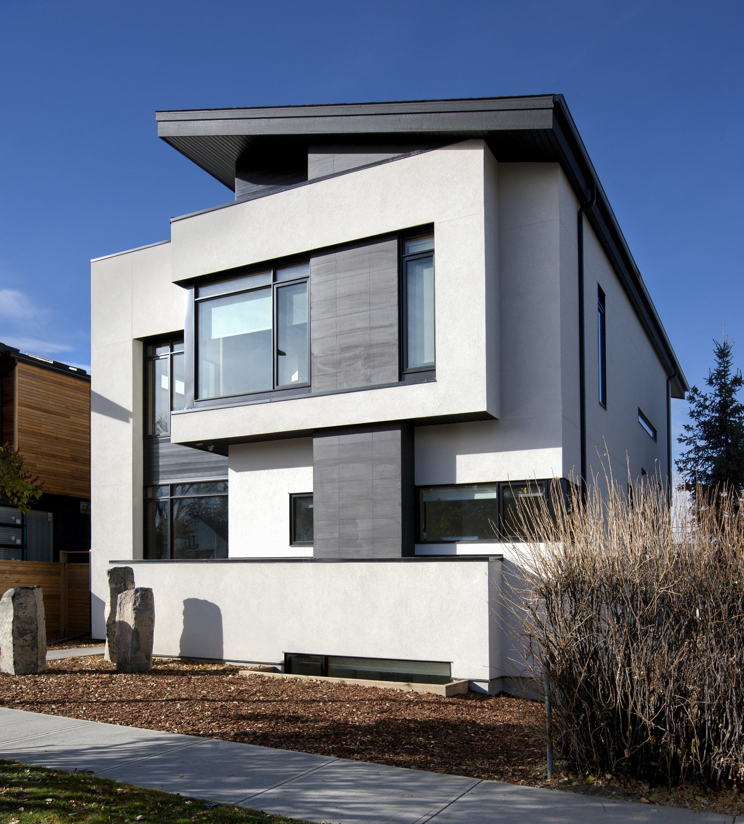
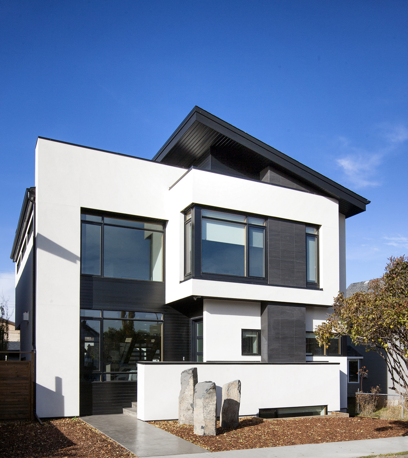
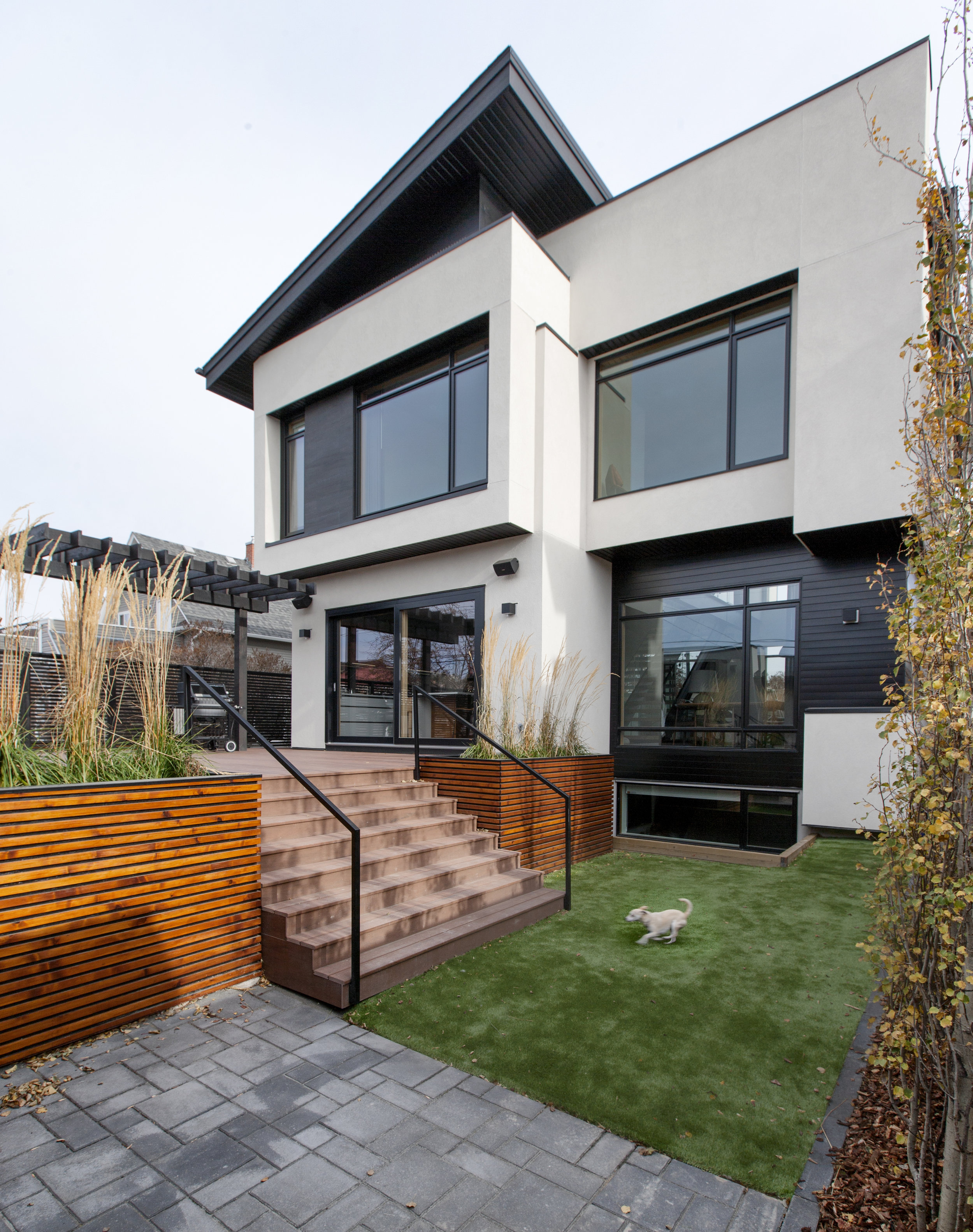
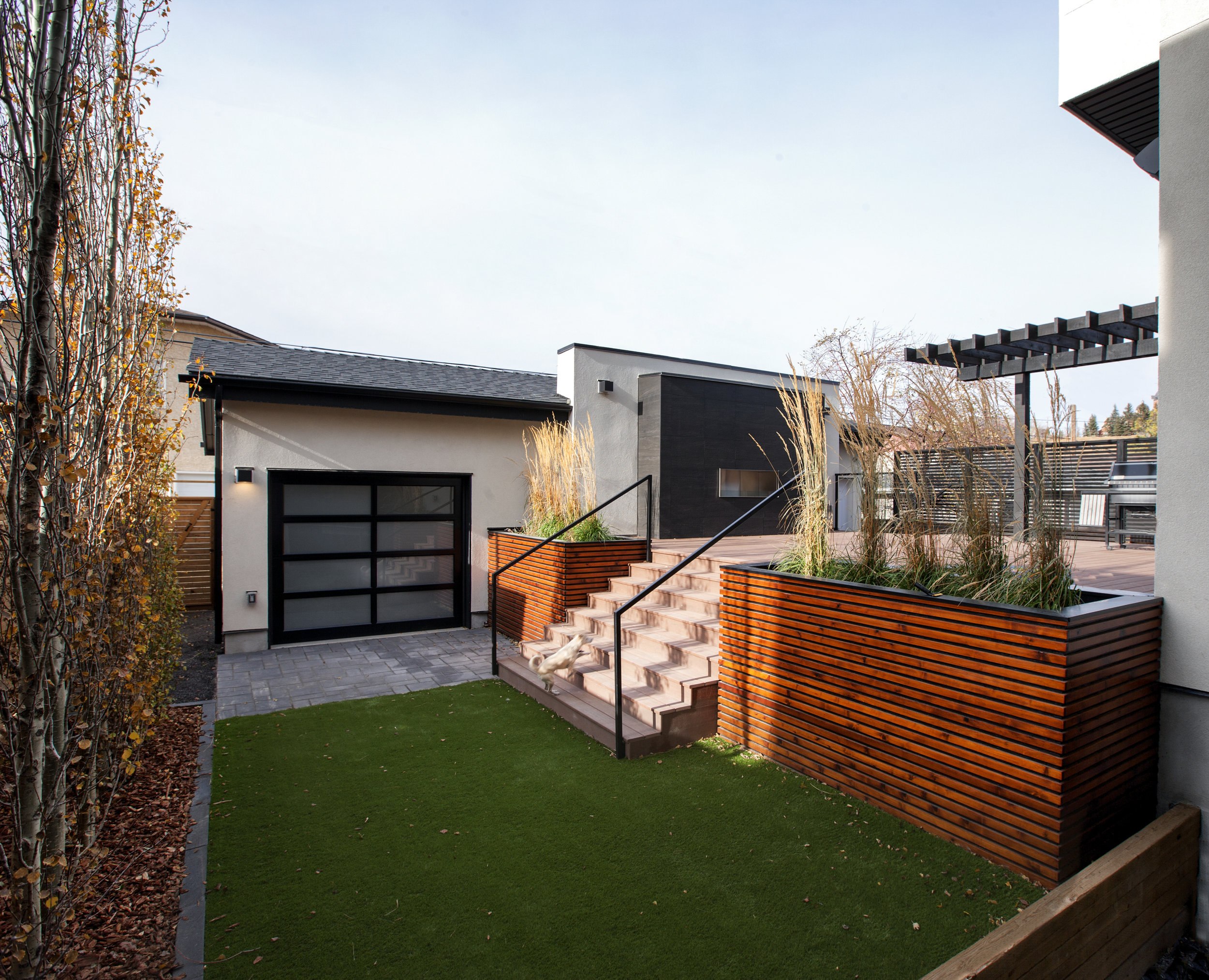
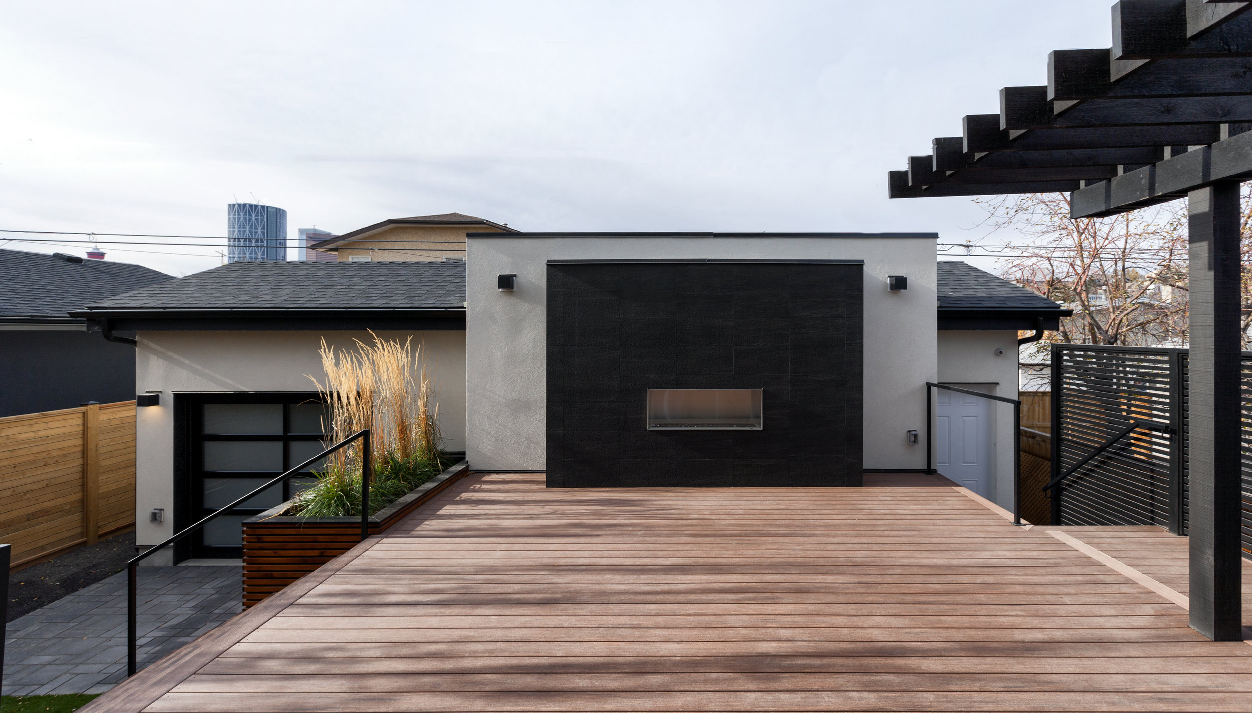
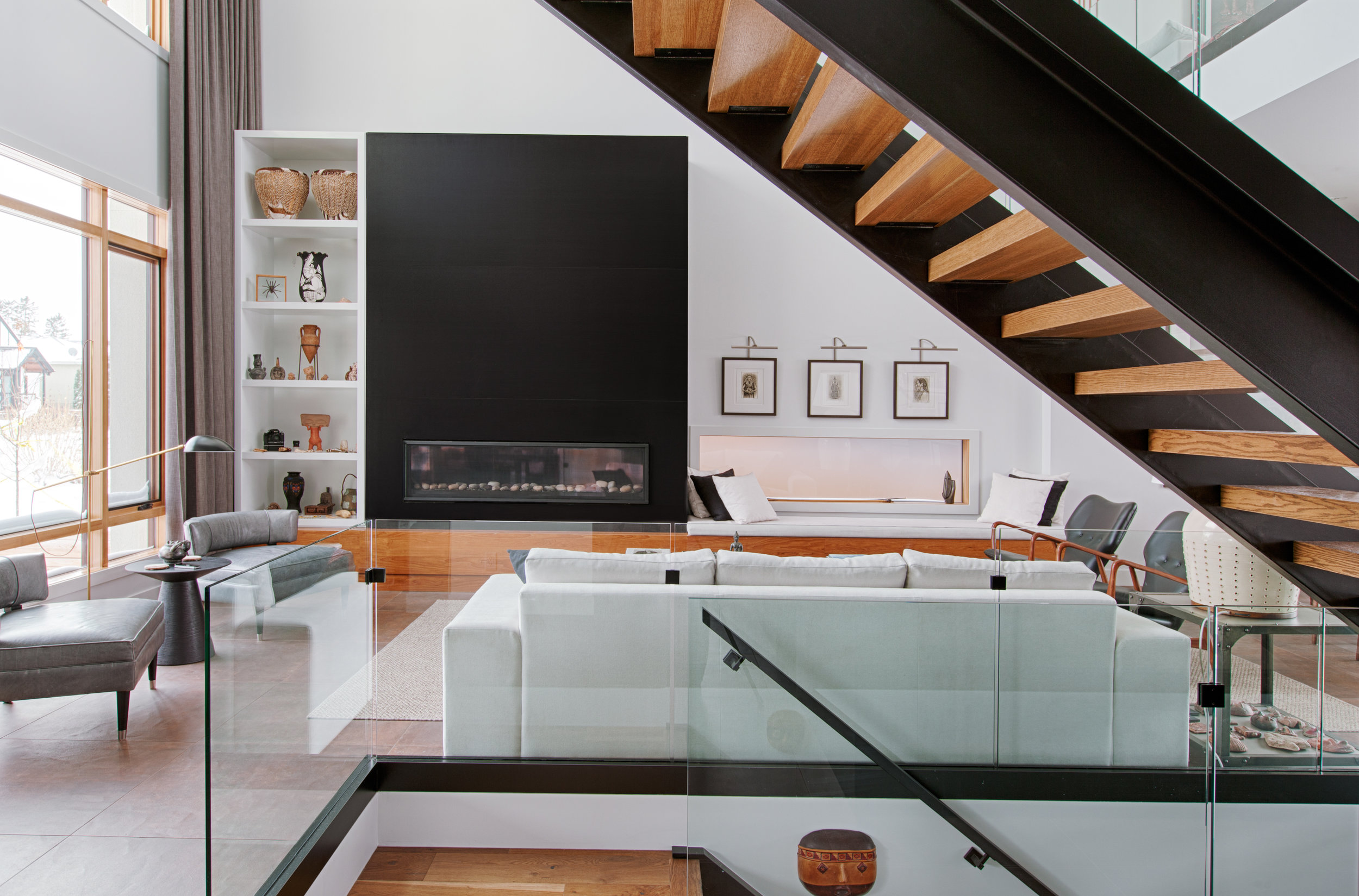
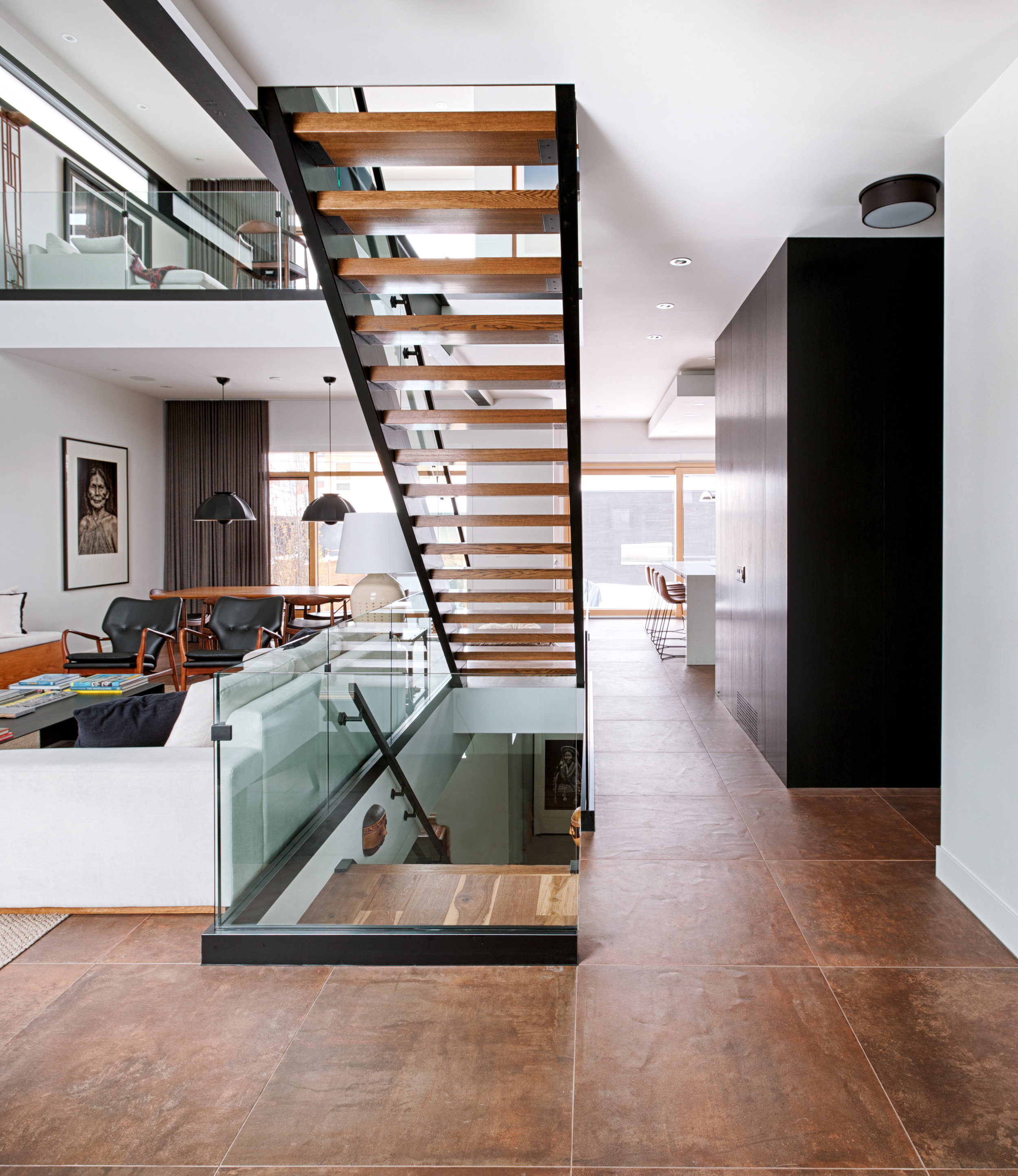
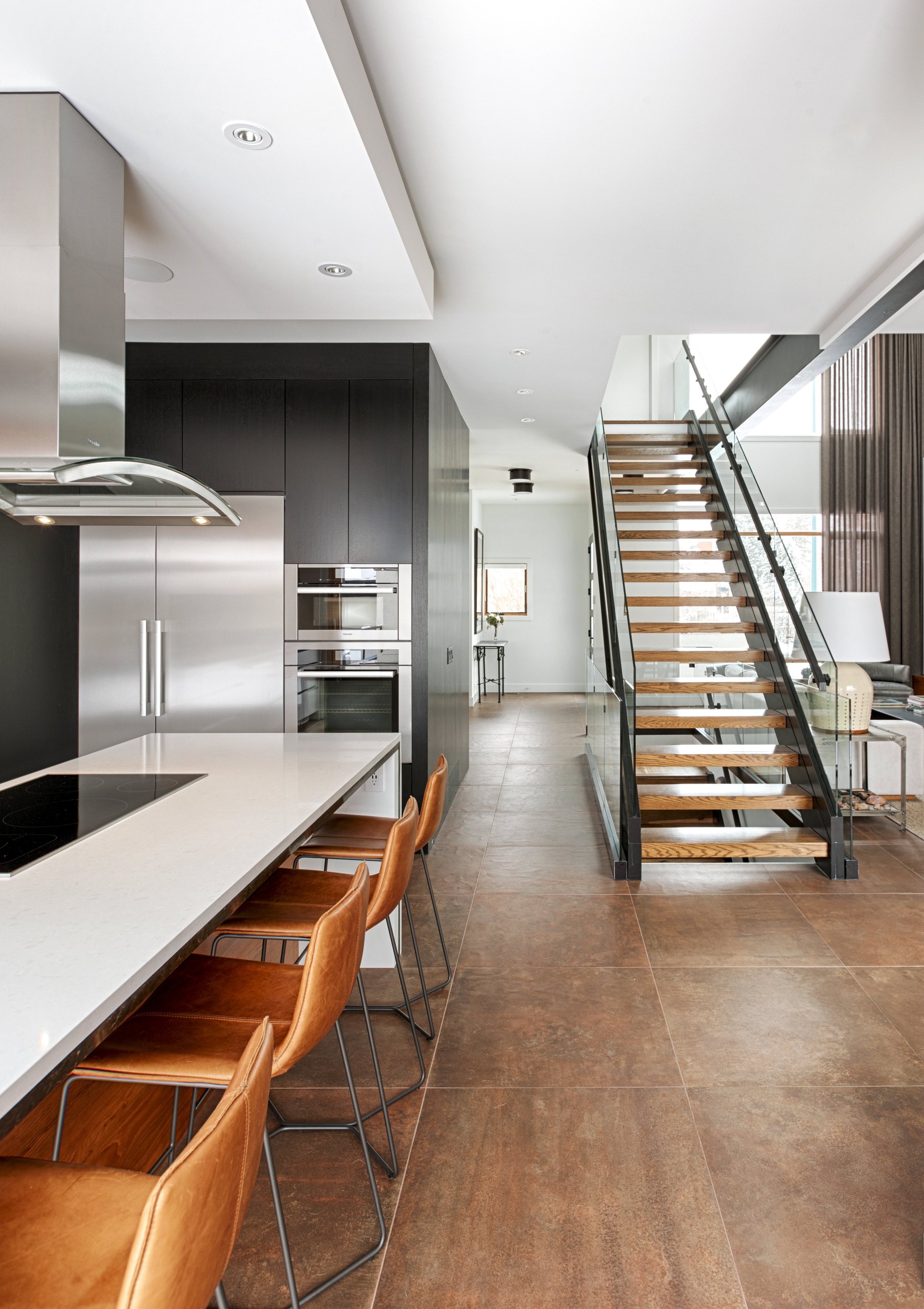
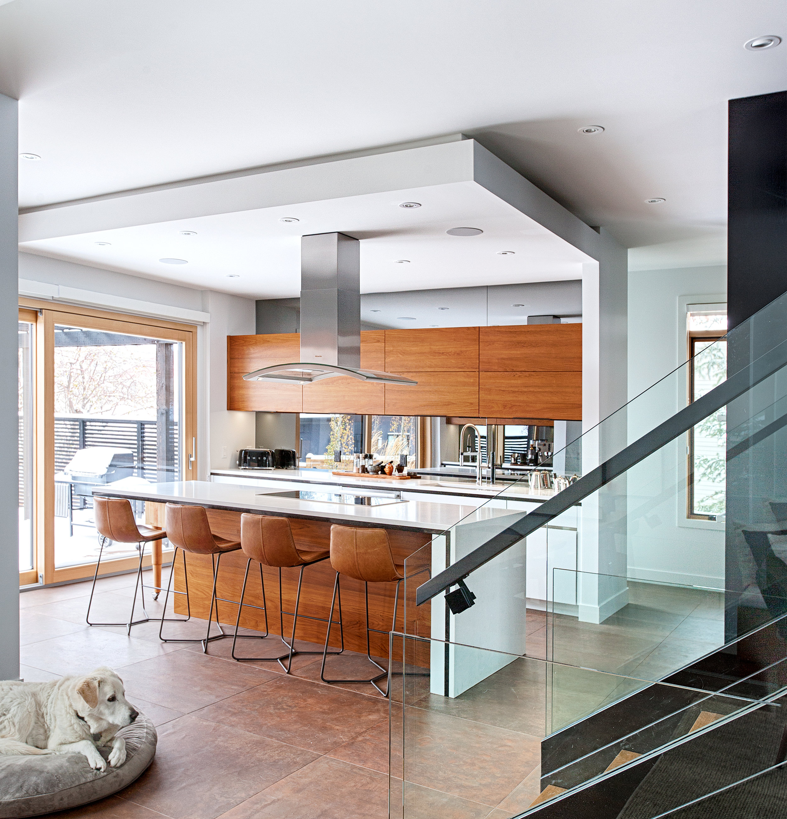
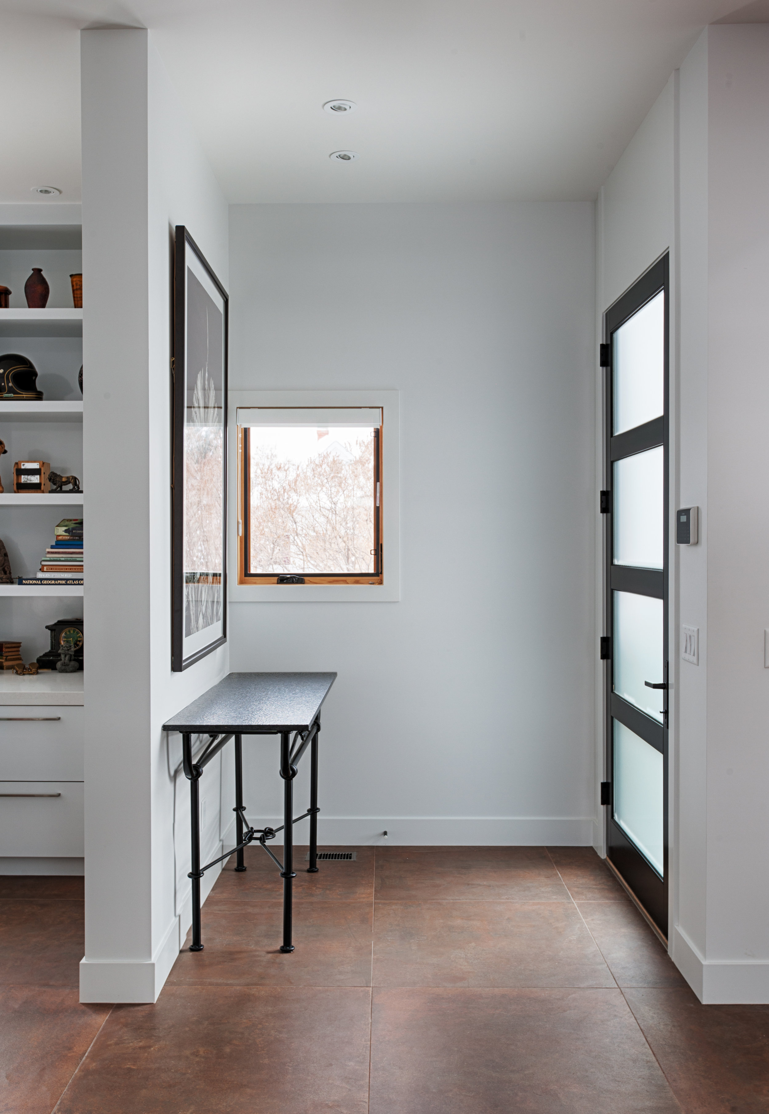
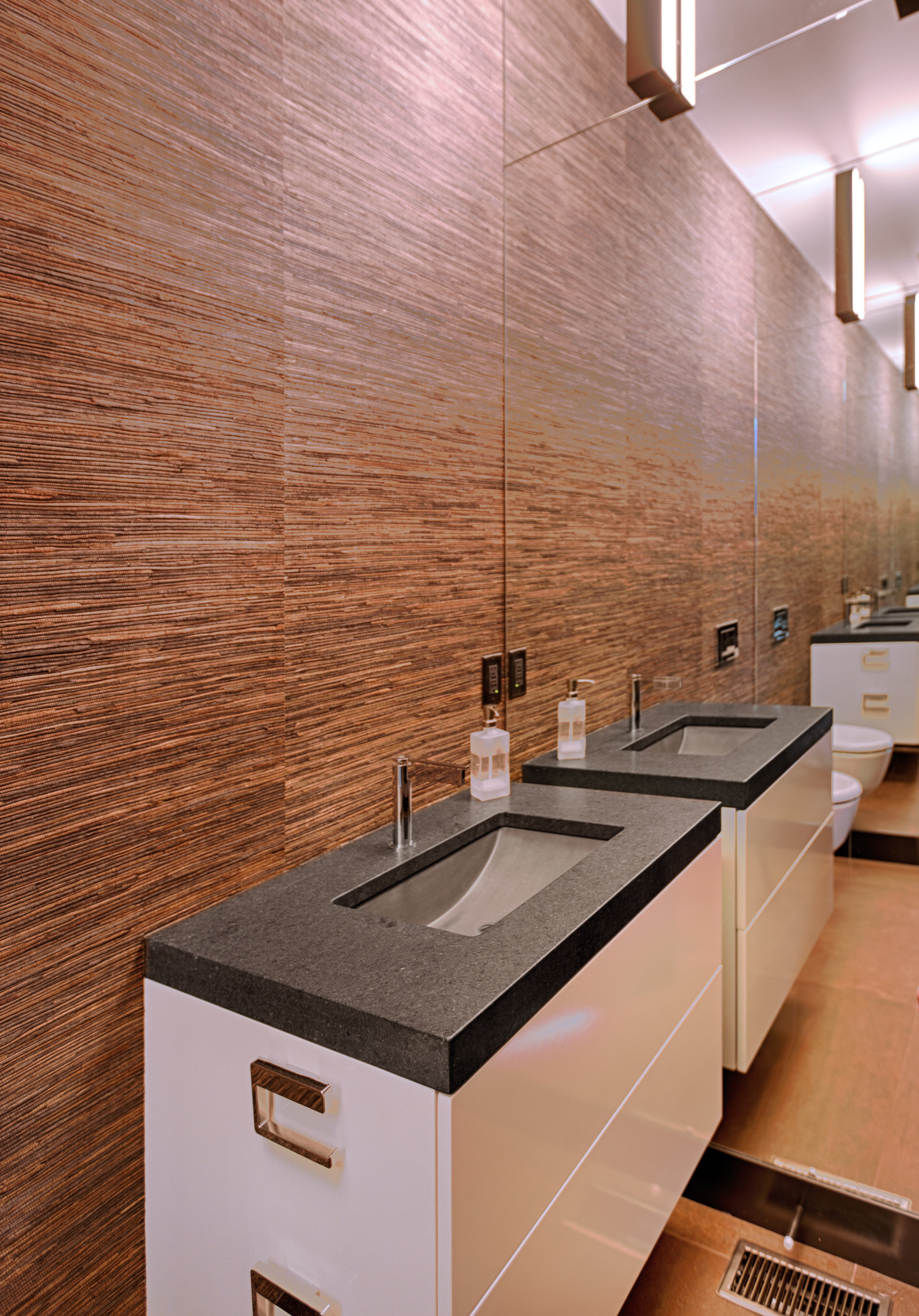
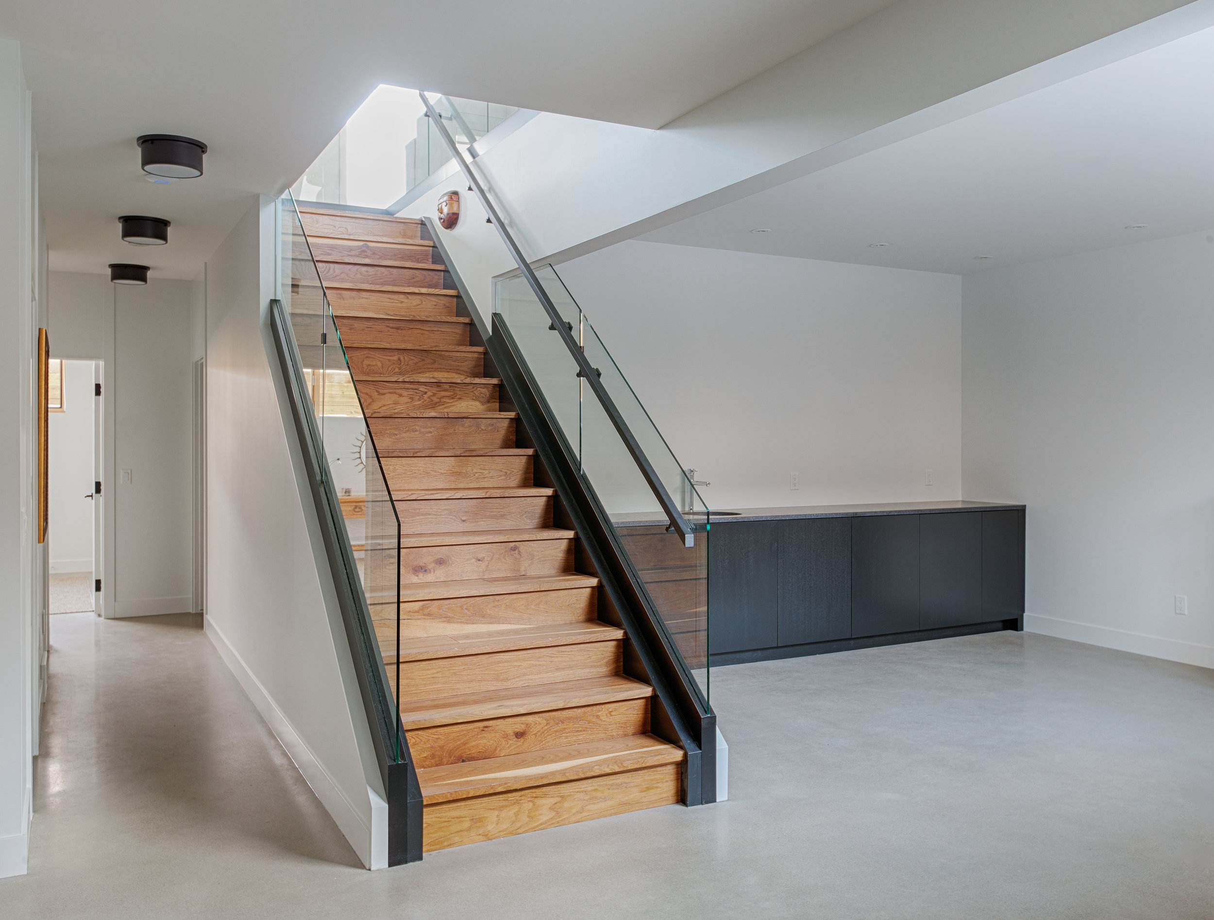
Gary Campbell just send us over these photographs he took of the Bridgeland House we designed for him and his wife Heidi. We're thrilled with how this project turned out.
The steel beam has been a part of the design from the beginning. It's is of course integral to the raw aesthetic of the house, but it also does the actual work of holding the second floor up. The motif of the steel beam has been repeated in the stair stringers.
This project started as a three storey house. As the design was refined, the third floor was removed so the basement could get more light. However, keeping the same-level relationship between the indoor and outdoor spaces remained important. The result is a split-level back yard with the deck at the main floor level, and the garden a half flight lower.
The house has no shortage of natural light. In addition to the large windows at the front and the rear of the house, high wide windows along the South elevation ensure that sunlight penetrates deep into the house at all times of day.
Kudos go to Rusch Projects for executing this project so well, to McIntyre Bills for the interior design and materials selection, and to Gary and Heidi for their commitment and attention to this project the whole way through. If you're curious about the construction process, please look at our previous posts that go right back to demolition day on August 2015.
San Mateo Highlands
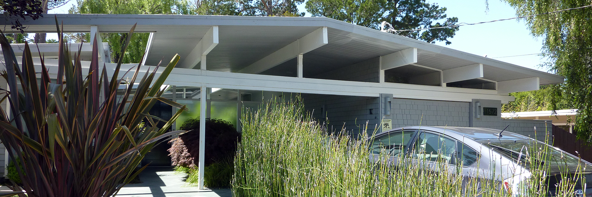
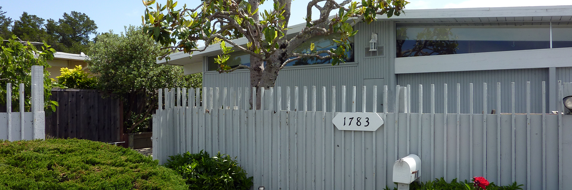
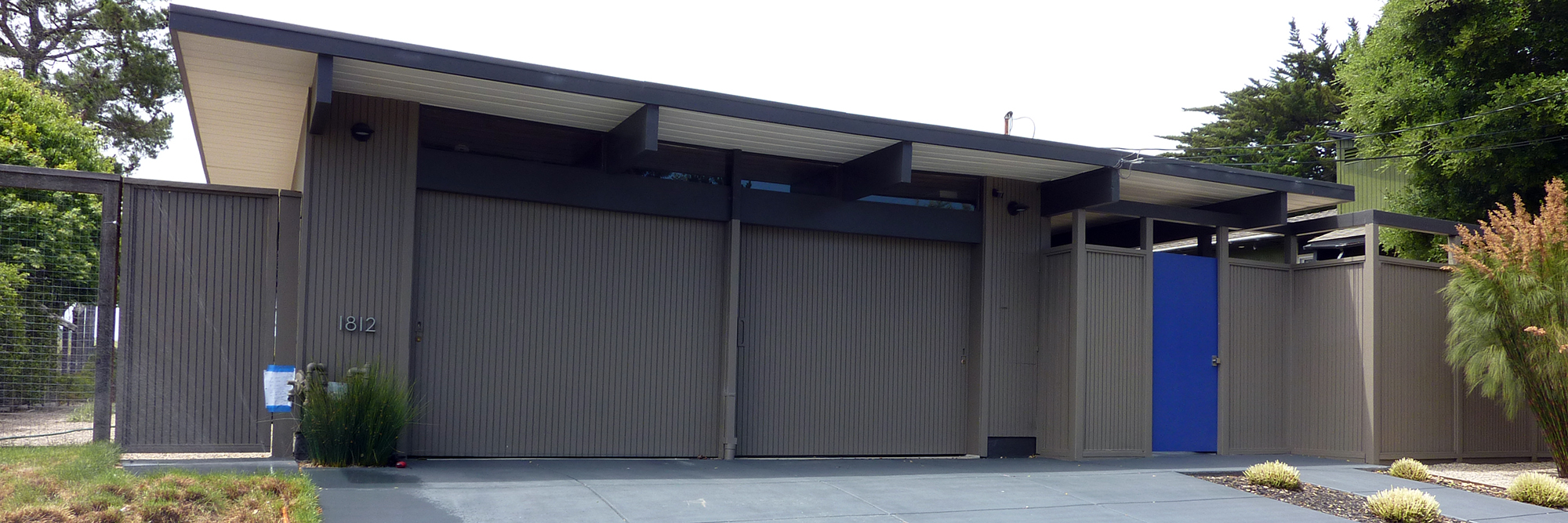
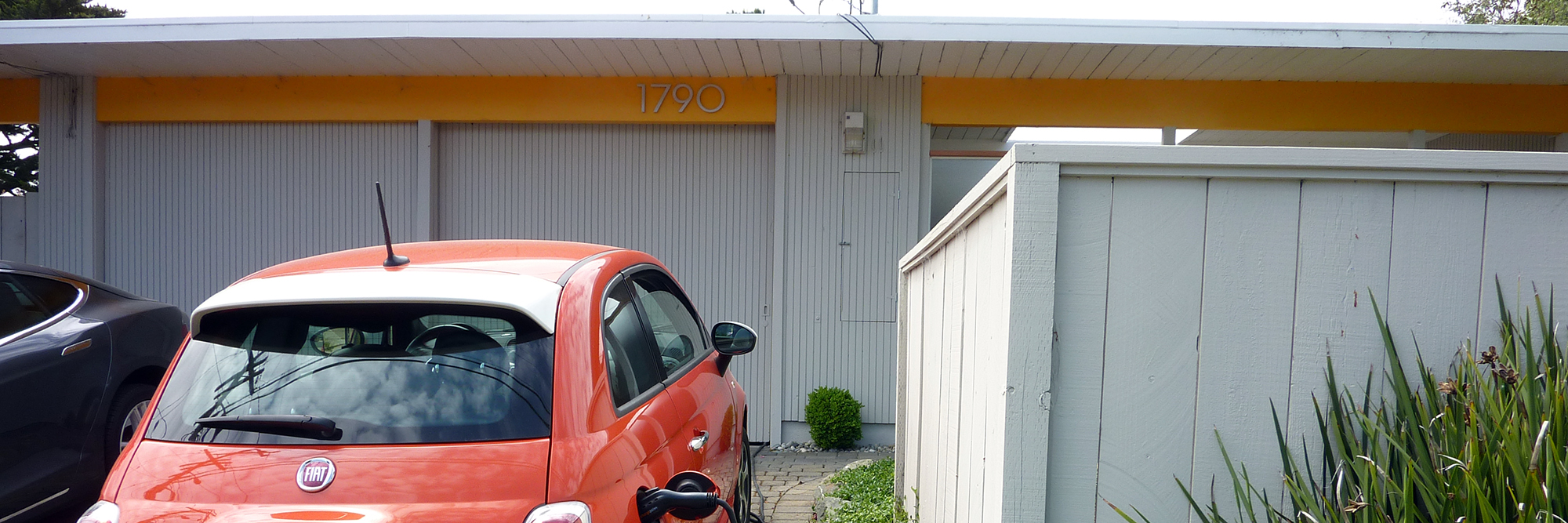
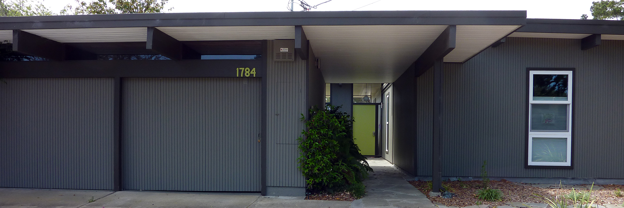
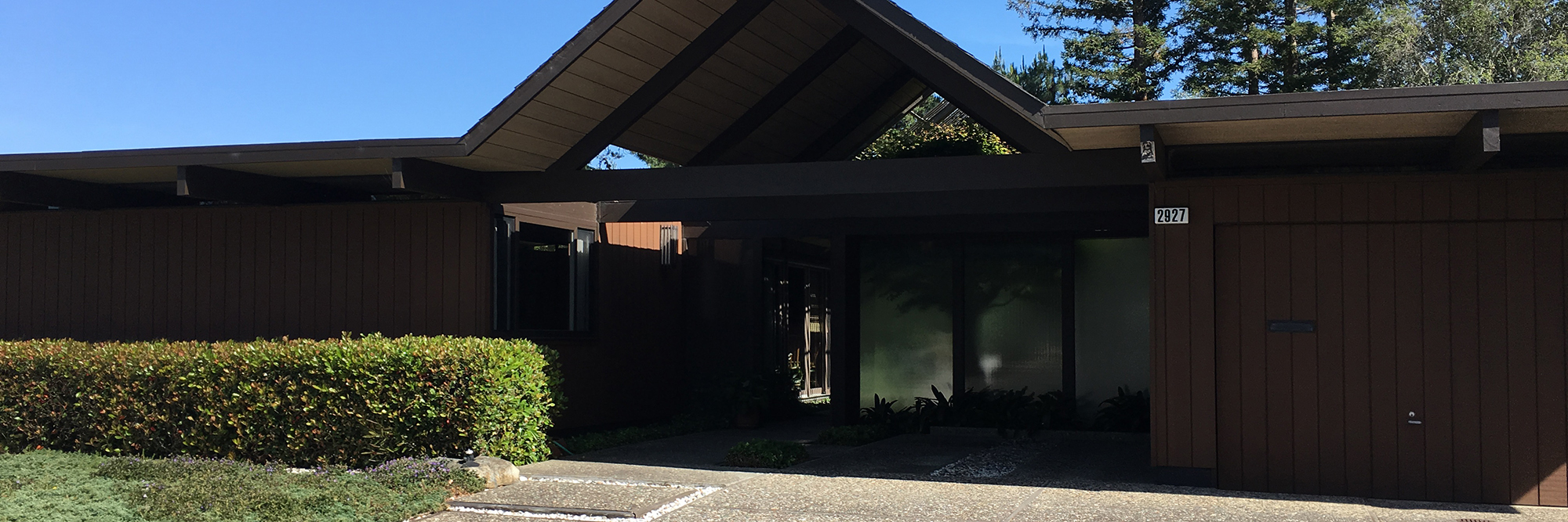
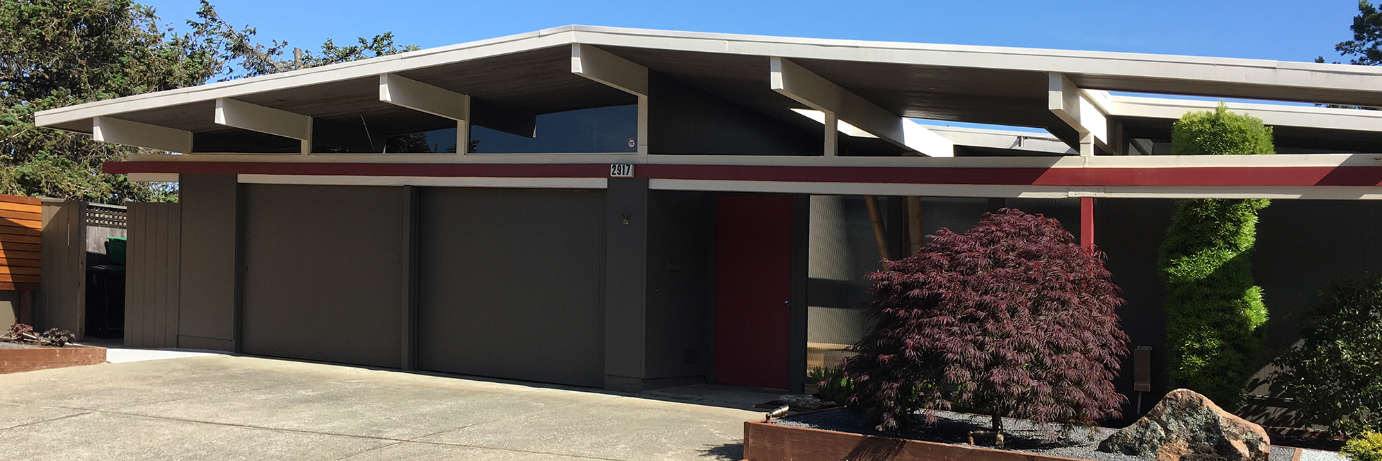
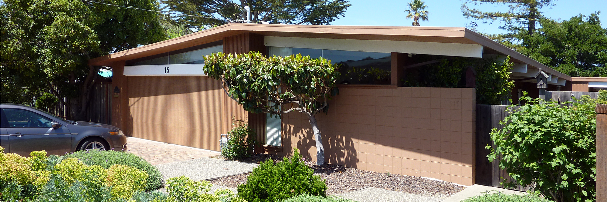
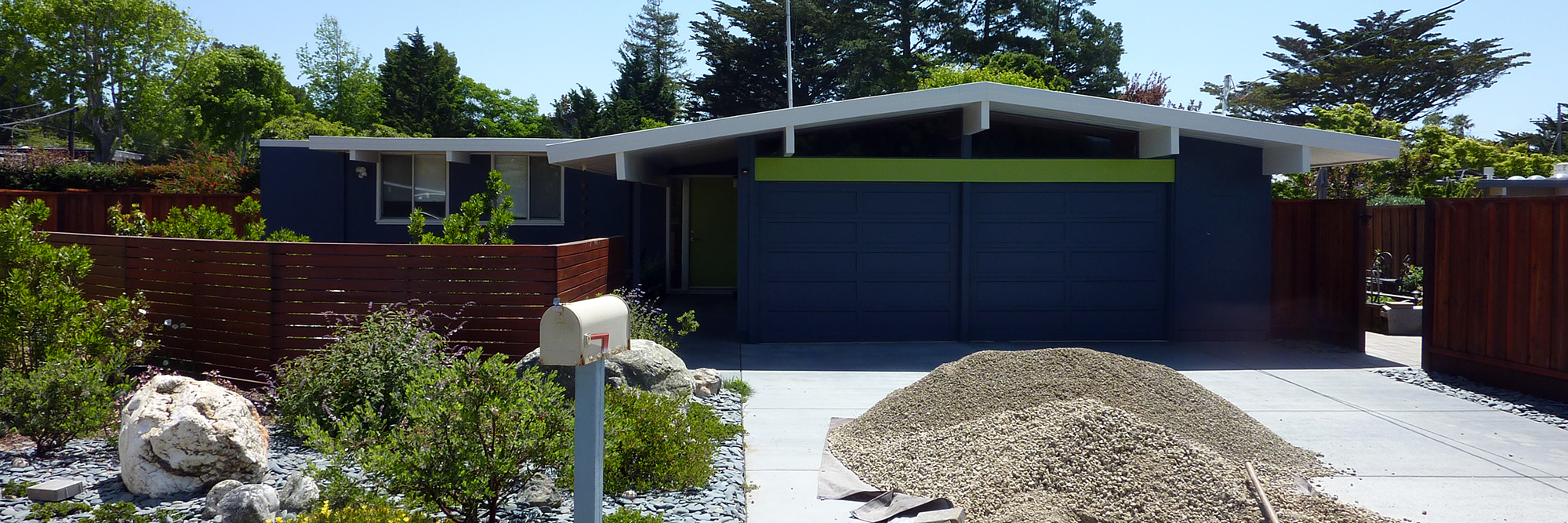
Joseph Eichler built iconic Mid-century Modern houses in California in the 1950s and 1960s. While he built over 11,000 houses over his career, the The Highlands of San Mateo, California is the largest contiguous development of Eichler homes. This past weekend, we had a chance to visit eleven of the approximately 700 Eichlers in the Highlands, as well as one in nearby Burlingame. We'll revisit most of them individually in this blog, but we wanted to begin with a gallery of houses that were not on the tour just so you can become familiar with the context of this unique late 1950s communities.
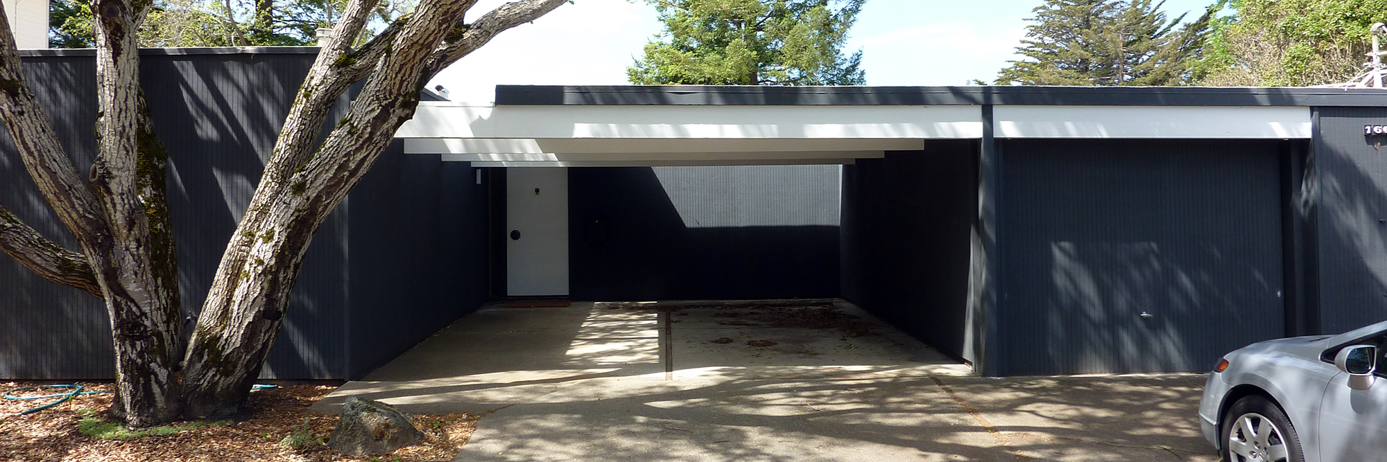
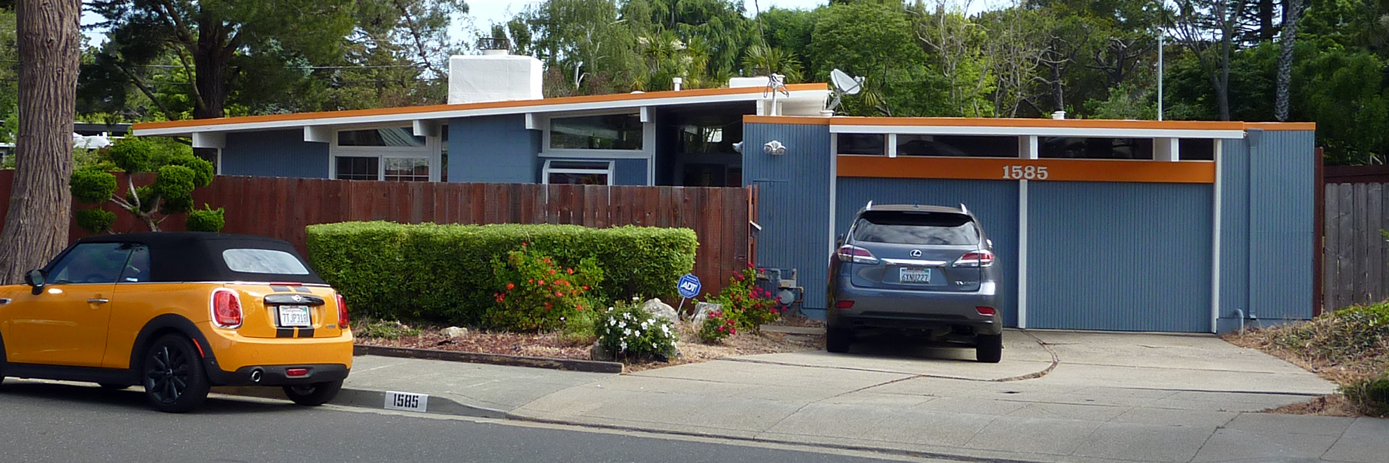
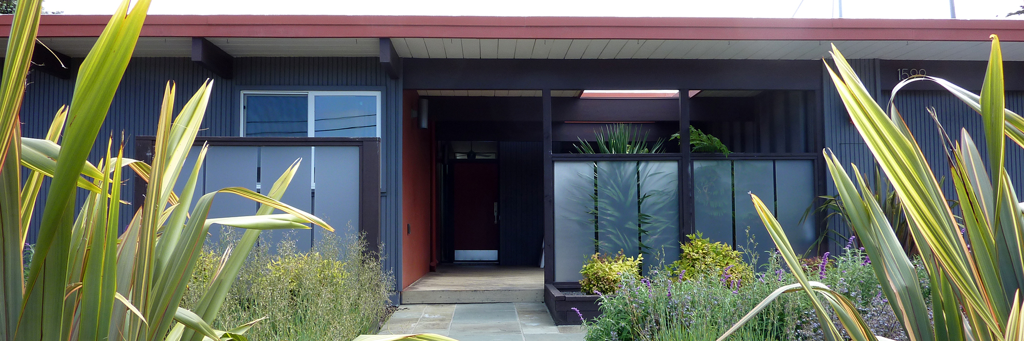
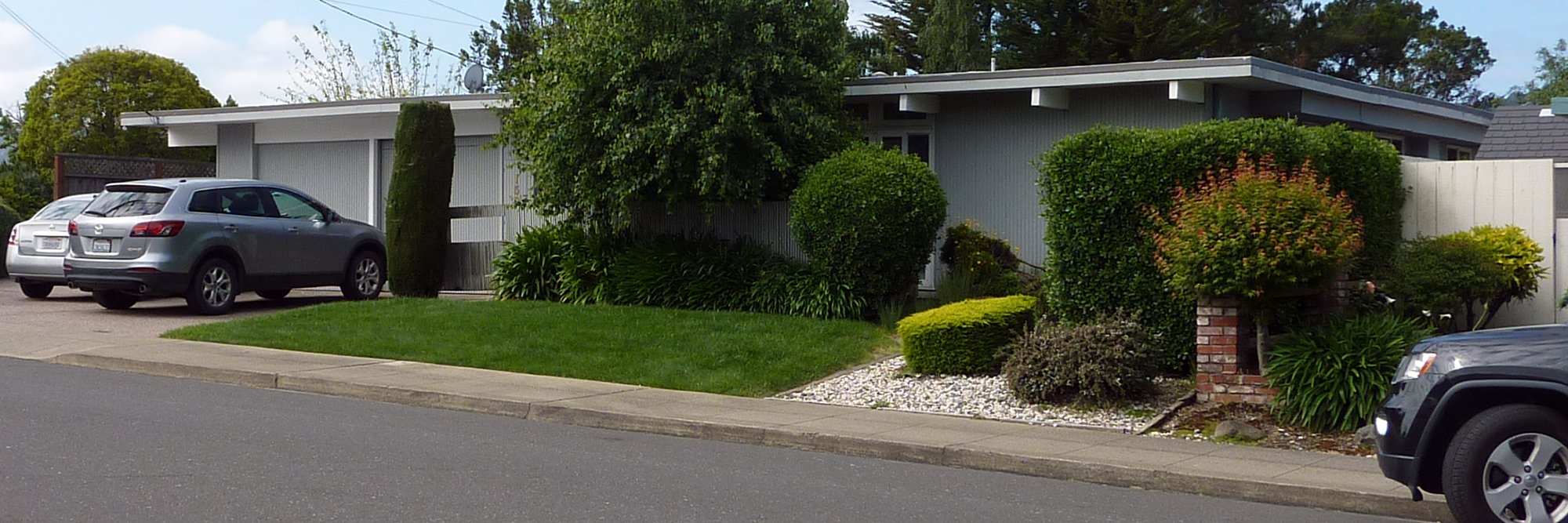

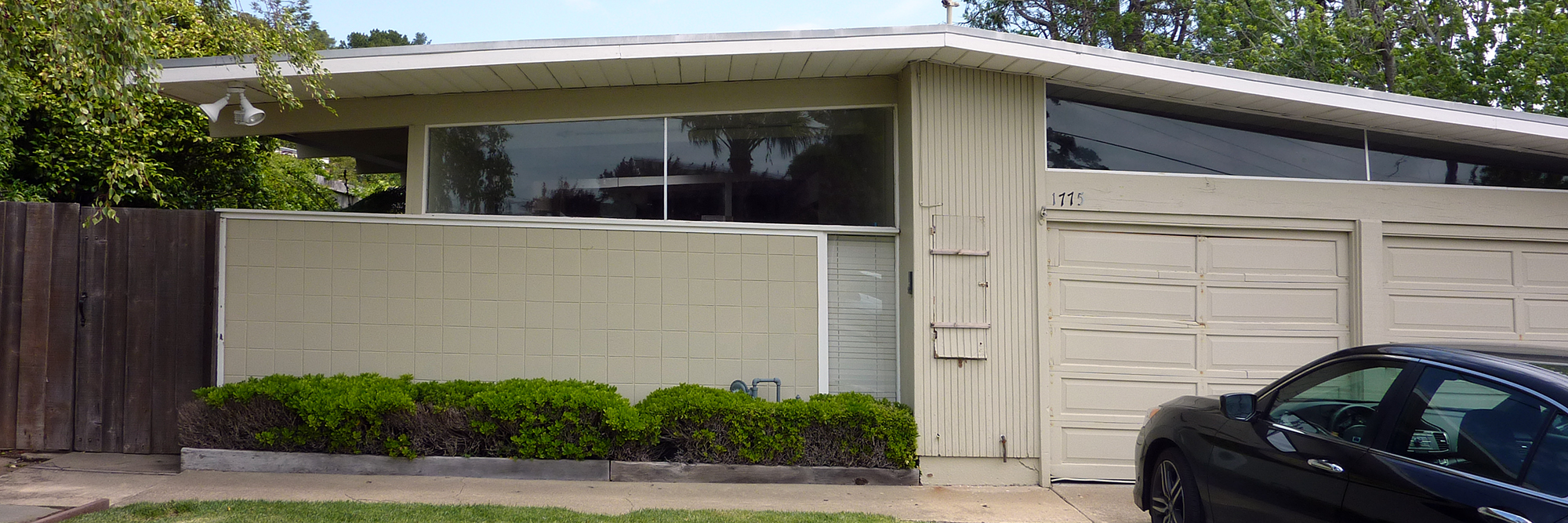

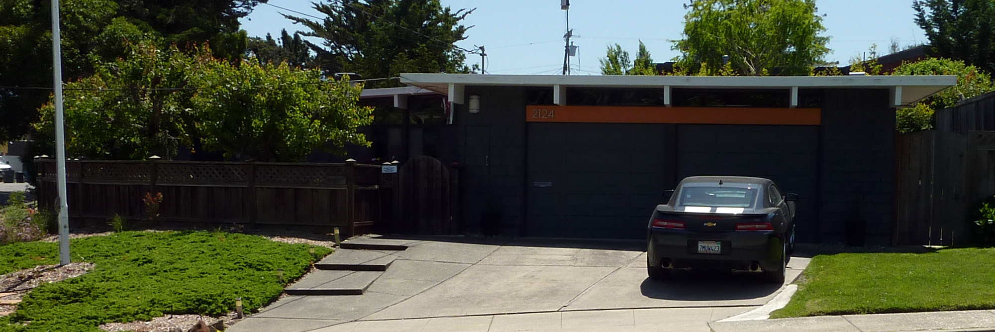
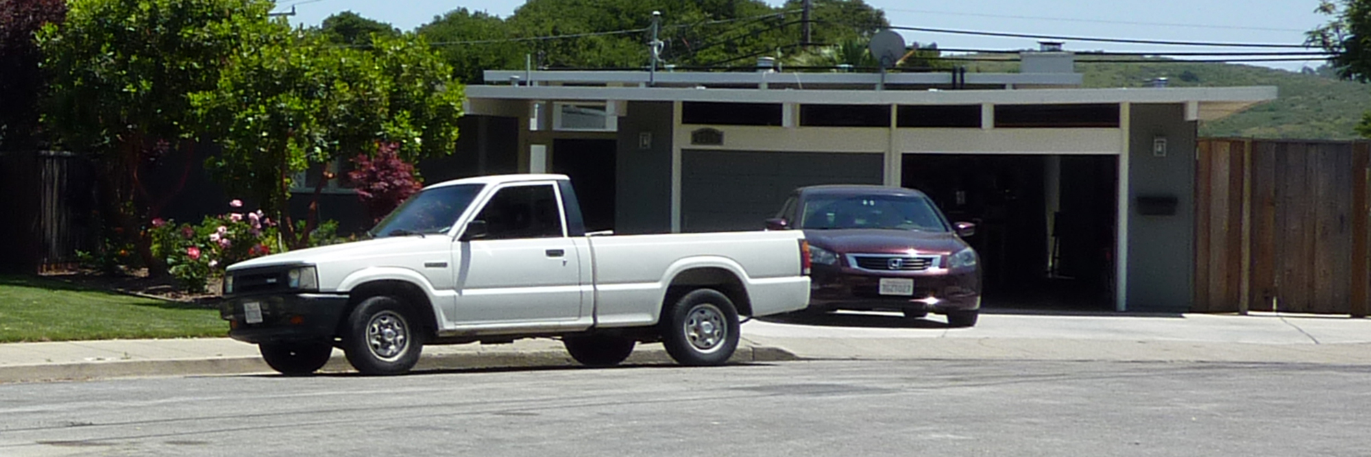
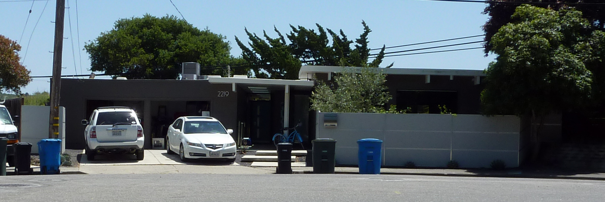

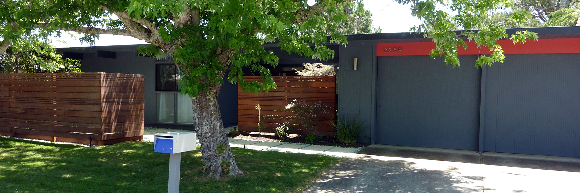
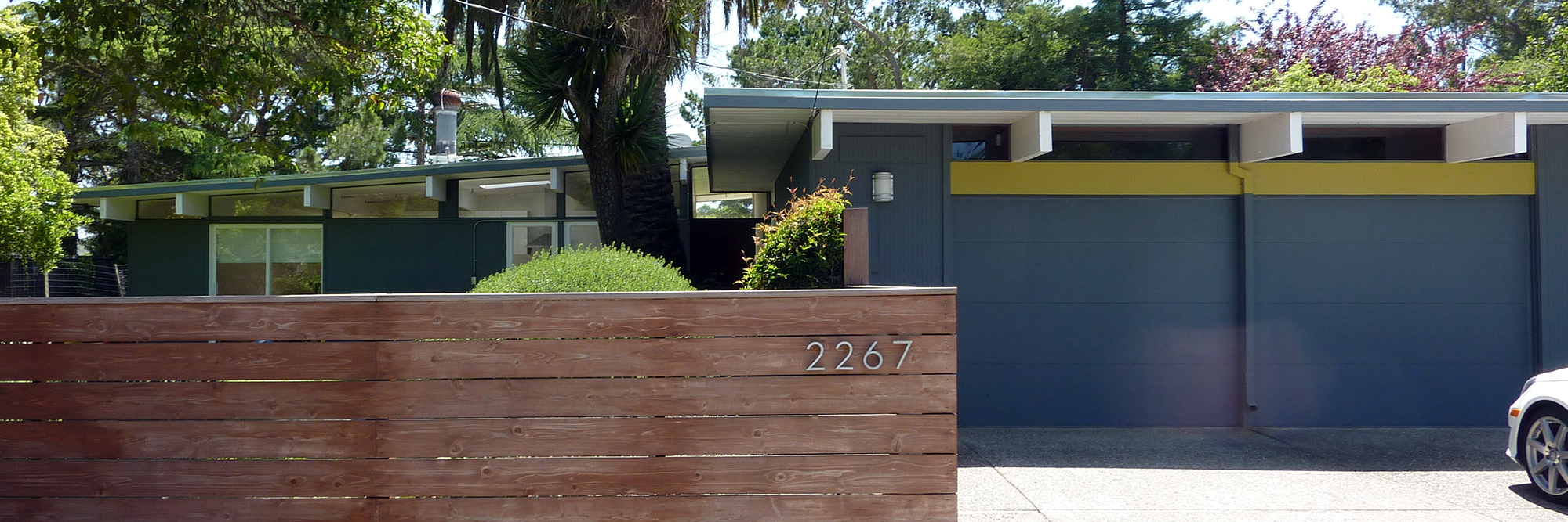
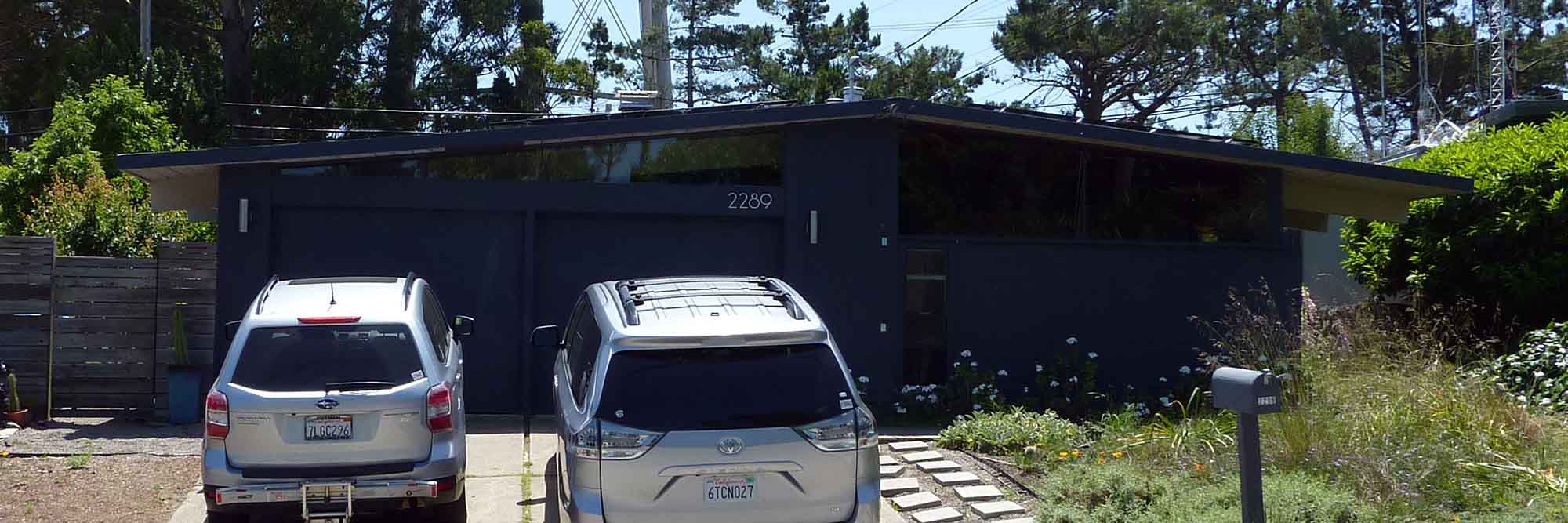
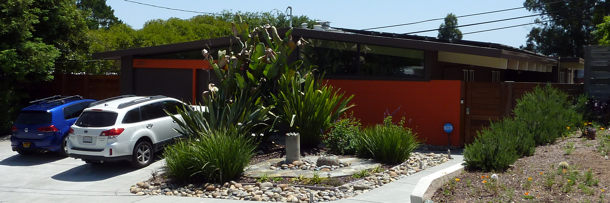

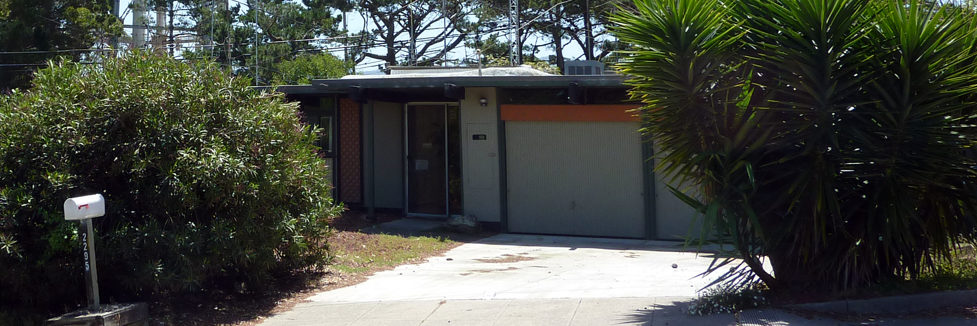


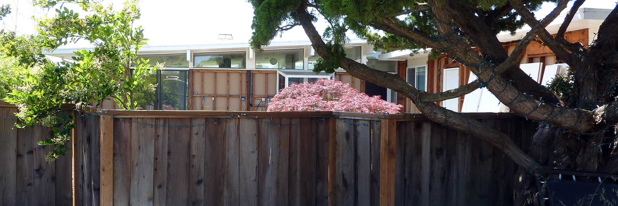
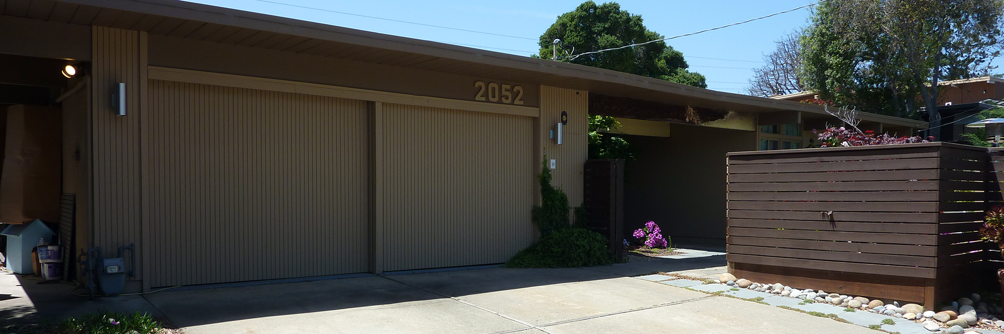
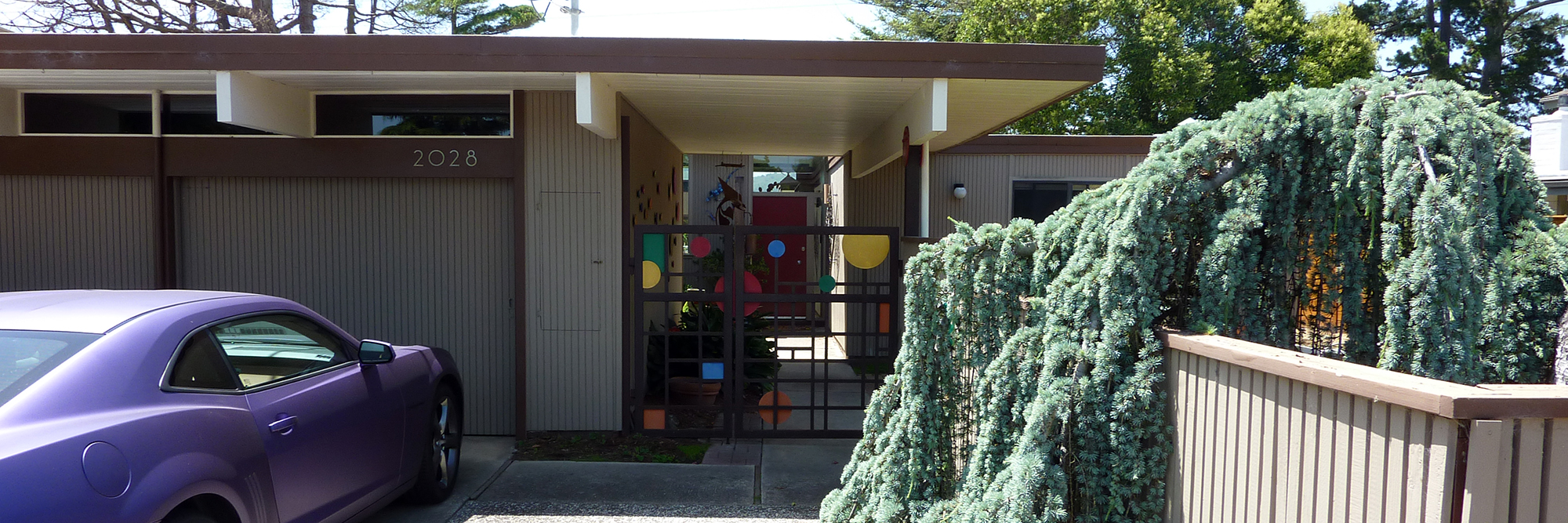
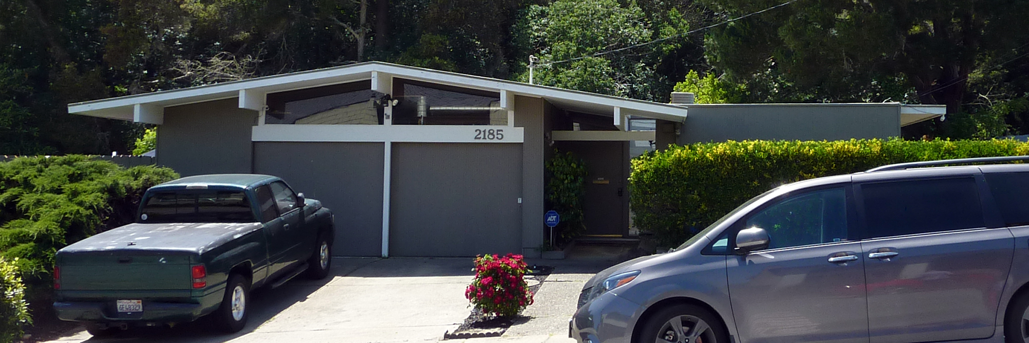
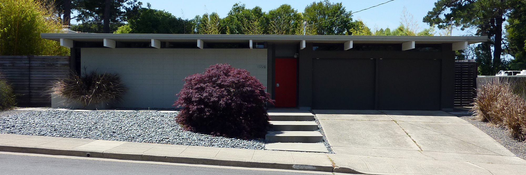
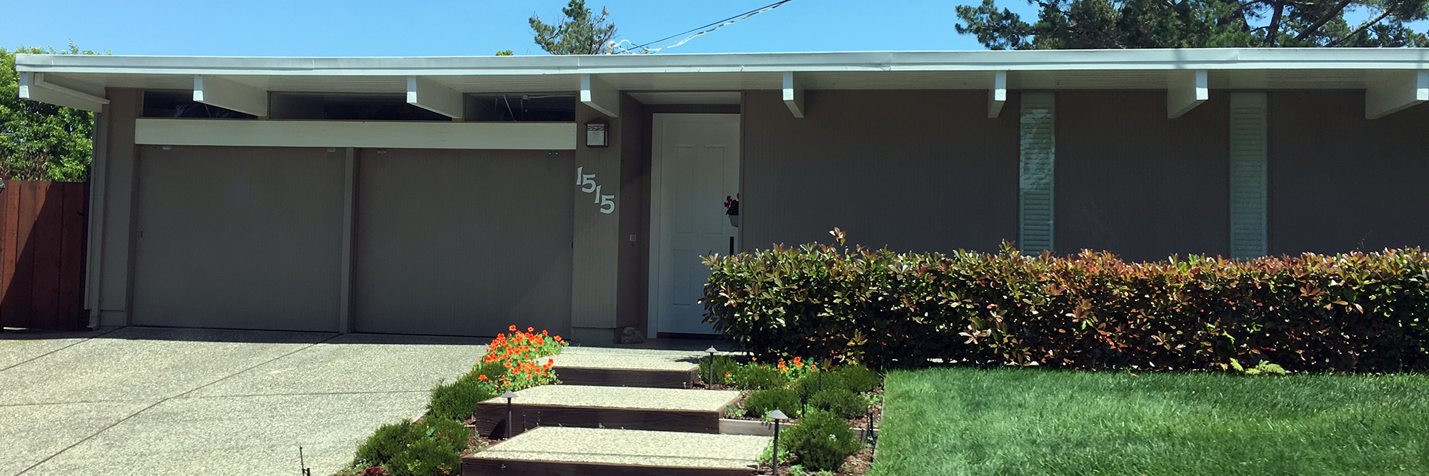
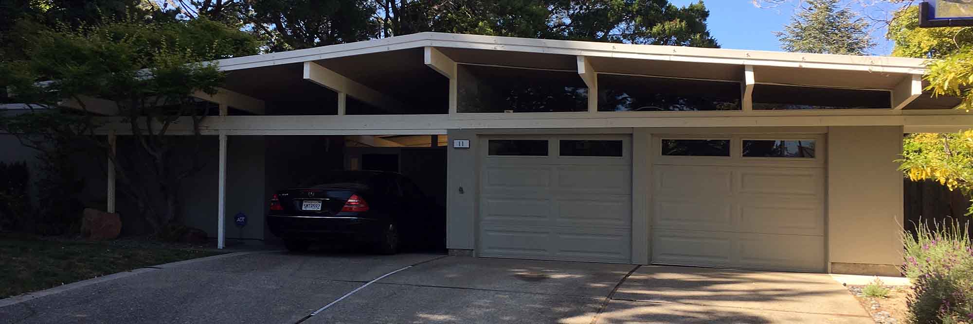
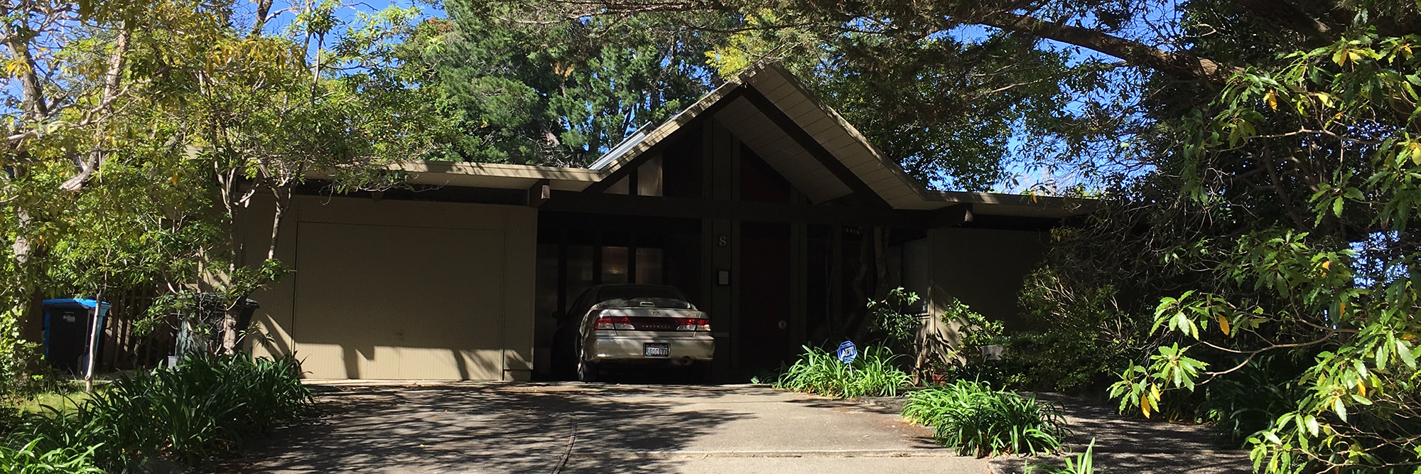
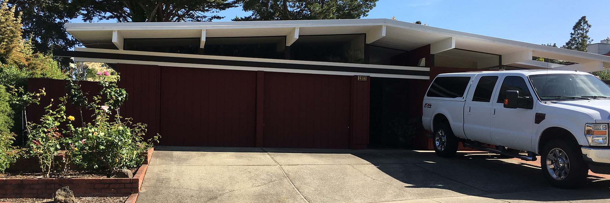
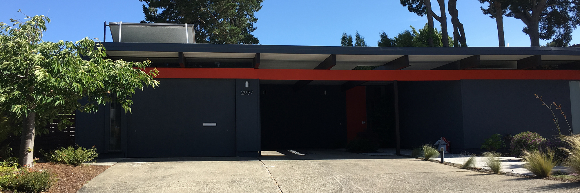
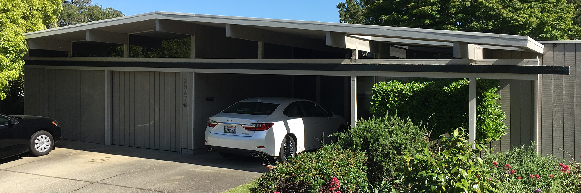
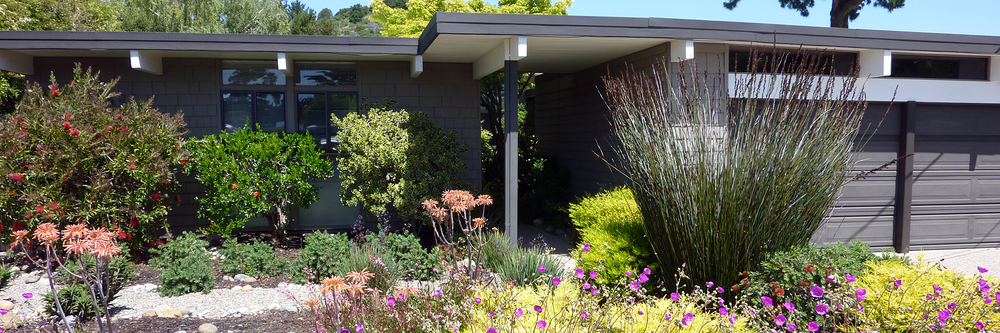
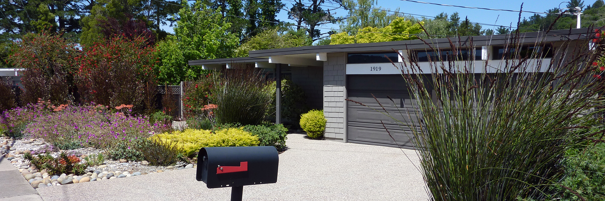
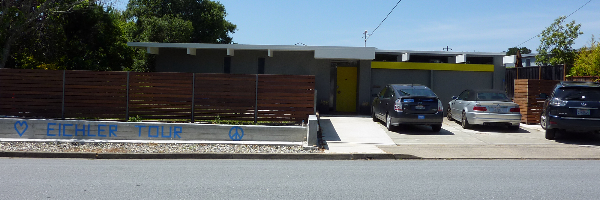
Pre Paint
The Brideland House was getting ready for interior painting last week. The windows were masked, the flooring was covered, and the heaters were running. Those oriented strand board sheets aren't part of the look; those are temporary guards standing in for the glass ones that will be installed later. The glass guards will be set into the aluminum shoe that you see in these pictures, and that shoe will be clad in black metal to match the stringers. A black handrail will be affixed to directly to the glass. (Those spruce steps are temporary as well!)
The exterior is also being worked on this week: black Longboard is being installed. We'll get some pictures posted here as soon as we can get them.
MA+DS Modern Home Tour 2016 - Part 2
In our last post, we discussed the first three projects we visited on the recent The Modern Architecture + Design Society Home Tour. The latter portion of our tour took us to the north west of the city. We went to St. Andrew's Heights, a neighbourhood blessed with amazing views and large lot sizes.
The NewGrowth House was an interesting contemporary design with an industrial feel, exemplified by the massive concrete walls of the house and the weathered corten steel fins used to tier the landscaping. We loved that the main architectural feature, the board-cast concrete wall, runs through the whole house and acts as a compass within the plan. The concrete on the interior was contrasted by the warmth of the dark walnut window frames. With it's front facing kitchen and dining space, the project captured light and views in the spaces most commonly inhabited by the residents.
We intentionally visited MBAC's house last and we wanted to end with a bang! Marc Boutin has always been one to push boundaries and create unique spaces, and we were not disappointed. The exterior features a factory-like corrugated metal siding paired with cedar tongue and groove. From the front, the house appears to be the size of a low-lying bungalow. However, once we stepped inside, we discovered that the grade quickly dropped down to the backyard and allowed for a full walk-out basement. The L-shaped house created a courtyard between it's two wings. The two-level elevations facing the courtyard were clad with full curtain walls spanning from the basement floor to the roof. Aluminum grating at the roof overhang shielded the space from direct sun without significantly limiting the views or light available to the spaces within. We appreciated the industrial and commercial materials used in a residential project; they were tempered with wood cladding and many delicate millwork details that kept the interior feeling intimate.
Overall, we were pleasantly surprised by many new design types and ideas that are starting to emerge in Calgary. We get the sense that local housing design is becoming a lot more sophisticated and bold. Here's to the future of residential!
MA+DS Modern Home Tour 2016 - Part 1
We're happy that as the residential design industry grows in Calgary, local practitioners have started to share their knowledge and experience with each other. The Modern Architecture + Design Society Home Tour was a great leap forward, where we got to experience first-hand some of the innovations our fellow designers have put to use.
Our first stop on the home tour was in Bridgeland (a community we are working in frequently) to visit a project on a narrow lot along 4th Avenue designed by KaBeN. Slim parcels have their own challenges, but KaBeN took on another by designing a sustainable house.
We were pleasantly surprised by the materiality of the house: the cork floors, plywood on the walls upstairs, oak on the ceilings, etc. The main floor was polished concrete, while the upper floor was cork—a great example of using materials to differentiate between public and private spaces. The narrow 22' lot meant that the interior would be quite tight, so partitions on the main were kept to a minimum and spaces, such as the kitchen, was delineated using bulkheads.
Our next stop was the reFAB design by HouseBrand, which was a project designed for aging-in-place. John Brown is addressing a growing market for individuals who do not want to move every time their life changes.
One of the features we loved most about the design was the built-in millwork that separates rooms instead of stud-walls. The house has core walls for mechanical systems, but otherwise has a modular room design that allows for alternative layouts as needs change without major renovation. We also liked the clever use of cost-effective Hardie-board cladding, which was tiered in gradients of grey to add more variety and tone to the exterior.
Next we visited RNDSQR in their show home in Marda Loop. They're experimenting with interior and exterior textures to add complexity to clean, streamlined designs. Exteriors feature natural-tinted cedar shakes on west-fasting facades while the interior showcases an patterned steel screen to act as a guard for the stairs and geometric tiles on walls and bathroom counters tops.
Stay tuned for our next post too see the other houses!
Stair Install
Some magic happened at the Bridgeland House today: the steel stringers were installed. A feature stair is always something to celebrate, and we're certainly partial to power-coated steel.
Powder-coated steel is a material that never goes out of style. It's the material that we are used to seeing in an industrial context such as warehouses and factories because these uses required durable finishes. When these spaces gentrified into art-galleries and lofts, the rough-and-ready aesthetic persisted.
We have gotten so used to seeing powder-coated steel in these converted industrial buildings that it is no longer a foreign material in a residential context. That said, it is not a common material and still makes the strong statement that a stair is not just a means of getting from floor to floor, but an object of beauty in and of itself.
The C-channel stringers have two flanges are on the outboard side of the web, giving the stair a "book-ended" look. Angle iron flanges are welded to the inside of each stringer to support the treads. The treads will be routed out so that the angle iron will be flush with the underside of each stringer.
This stair looks great with the matching exposed I-beam (protected by plastic in the image above). This I-beam doesn't just look pretty. It is supporting half of the second floor. Steel beams are very useful when spanning long distances without intermediate posts to support it. The result can be an open, continuous space, uninterrupted with vertical structural elements.
I don't know what else to say other than that these stringers are awesome! (Thanks to Gary Campbell for the photos.)
Steel Stringer
Maybe is seems strange to get excited about a chunk of C-channel extrusion, but it makes more sense when you know that it forms one of the steel stringers of the open-riser stair in our Bridgeland House. These stringers will be powder coated to match the exposed steel beam in the house and together will look awesome! Thanks to Gary Campbell for this photo.
Parkhill Rendering
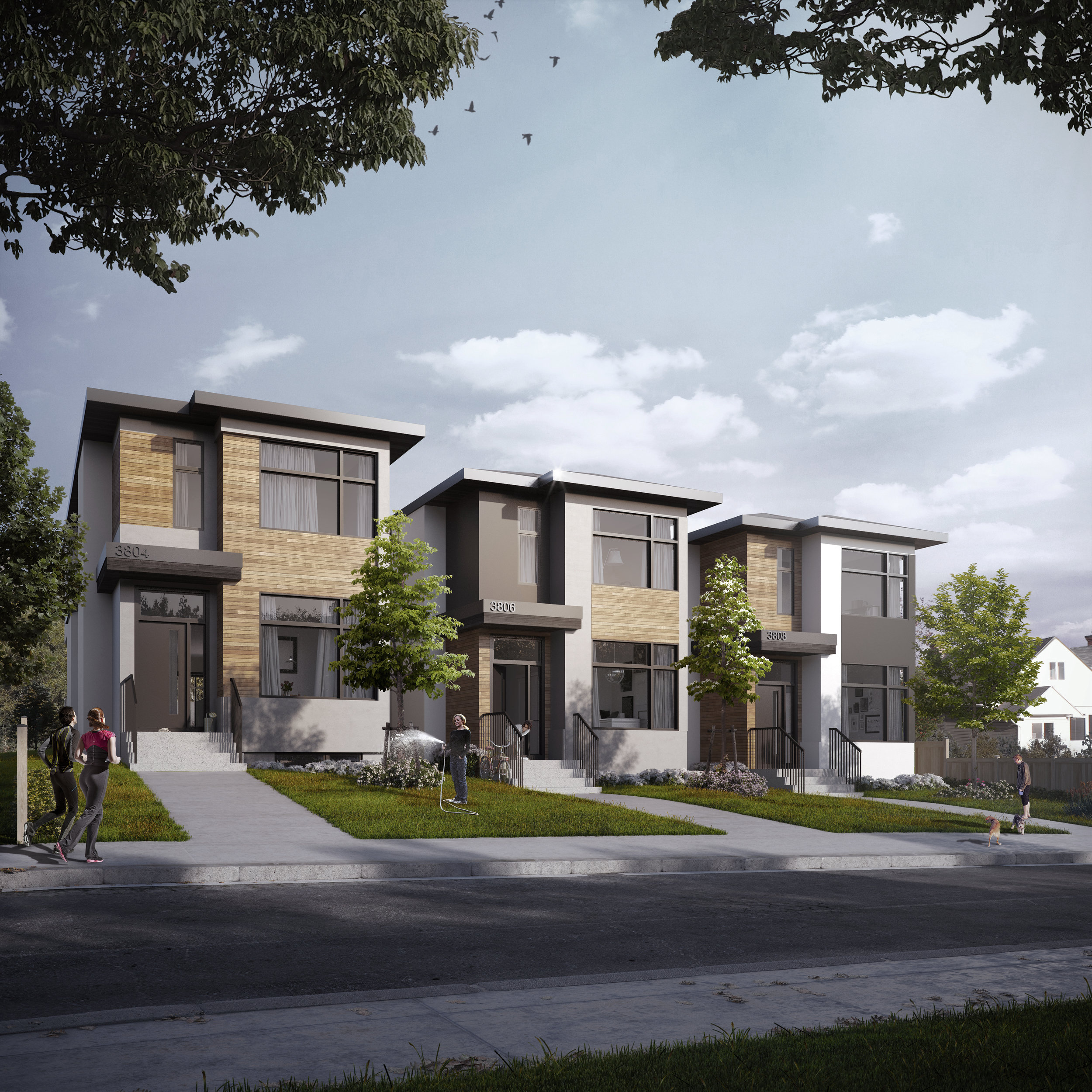
We've recently rendered a trio of single units being built in Parkhill. The left most house in the image is built, and the rendering is intended to illustrate what the streetscape will look like when all three houses are completed.
When orchestrating a rendering, we understand that our clients are asking for an image that will advertise their buildings convincingly. A rendering must capture the lifestyle of the community and project the mood of future residents for it to tell a story that purchasers can imagine themselves a part of.
We rendered the image with an intentional colour palette in mind; honey to bring out the woods, deep grey to emphasize the modern lines of the infills and soft blues to contrast the honeyed wood and white stucco. Using the palette, we started to create patterns that contrasted and complimented the three new homes. For example, the honey-tones are reiterated in the lighting, landscaping and even in the people in the image. The overall image feels engaging, real, simple and clean, allowing the focus to be on the buildings and what it would be like to live in them.
Great Light
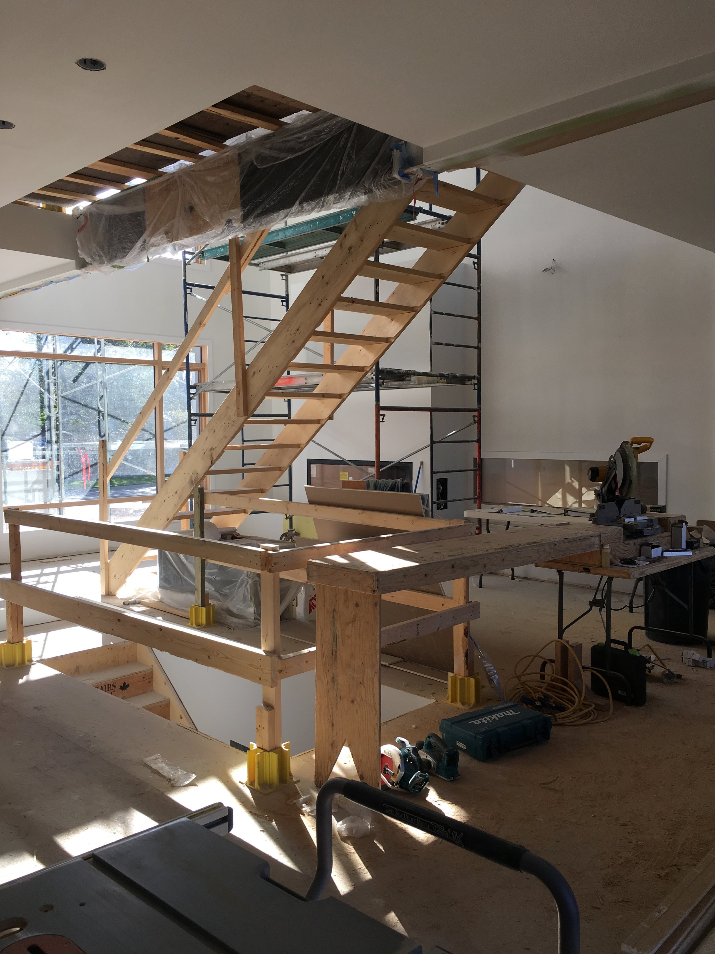
We're thrilled with the quality of light in the living room of the Bridgeland House! You can see in this image the steel beam that supports the upper floor which will be exposed in the stairwell and living room. The wooden stair in this image is temporary. We're looking forward to the matching steel staircase being installed.
Thanks to Gary Campbell for this photo.
Bridgeland Photoshoot
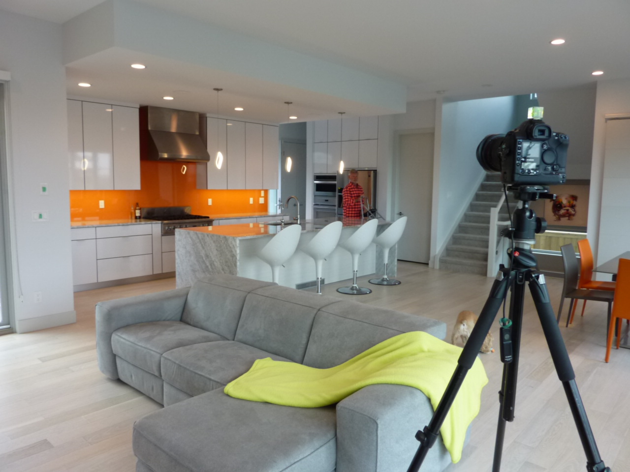
The week before last, Gary Campbell came out to one of our houses in Bridgeland to shoot the interiors.
We wanted to share some of the behind-the-scenes fun with you while we wait for the final images. We'll let you know when we have all the shots ready to share!
It's always such a pleasure to work with lovely and brave clients—just look at that orange! Apparently our client and his wife's favourite colours are green and orange and the decision came down to a friendly rock-paper-scissor show down! Needless to say, we are very partial to orange...
It's quite interesting how much prep-work goes into a single image. Selecting the angle is all about including as much information as possible, while keeping in mind overall composition, the quality of light coming from different sources, the height of various light-fixtures, etc. It's no wonder Gary's wife, Heidi, is also his assistant; she provides a second set of discerning eyes to edit the scene as he preps his camera.
One of the biggest questions we had to address was showing personal items in the house. This is a huge editing question that is hard to balance. Magazines, such as Dwell, often photograph projects where people and their furniture and their kids and even their dogs are included—it gives the images a certain warmth. So the owner's adorable dog, Fobby, became our model. Now it was just a question of making him understand that his job description had changed for the next few hours:
Gary and Fobby became pals, eventually. We're trying to encourage Fobby to get his own LinkedIn page so his followers can endorse him for sitting, staying, shaking and modelling.
You might ask, how does one live in a house without all the stuff you need on a day to day basis? Let's just say that it was never far away....
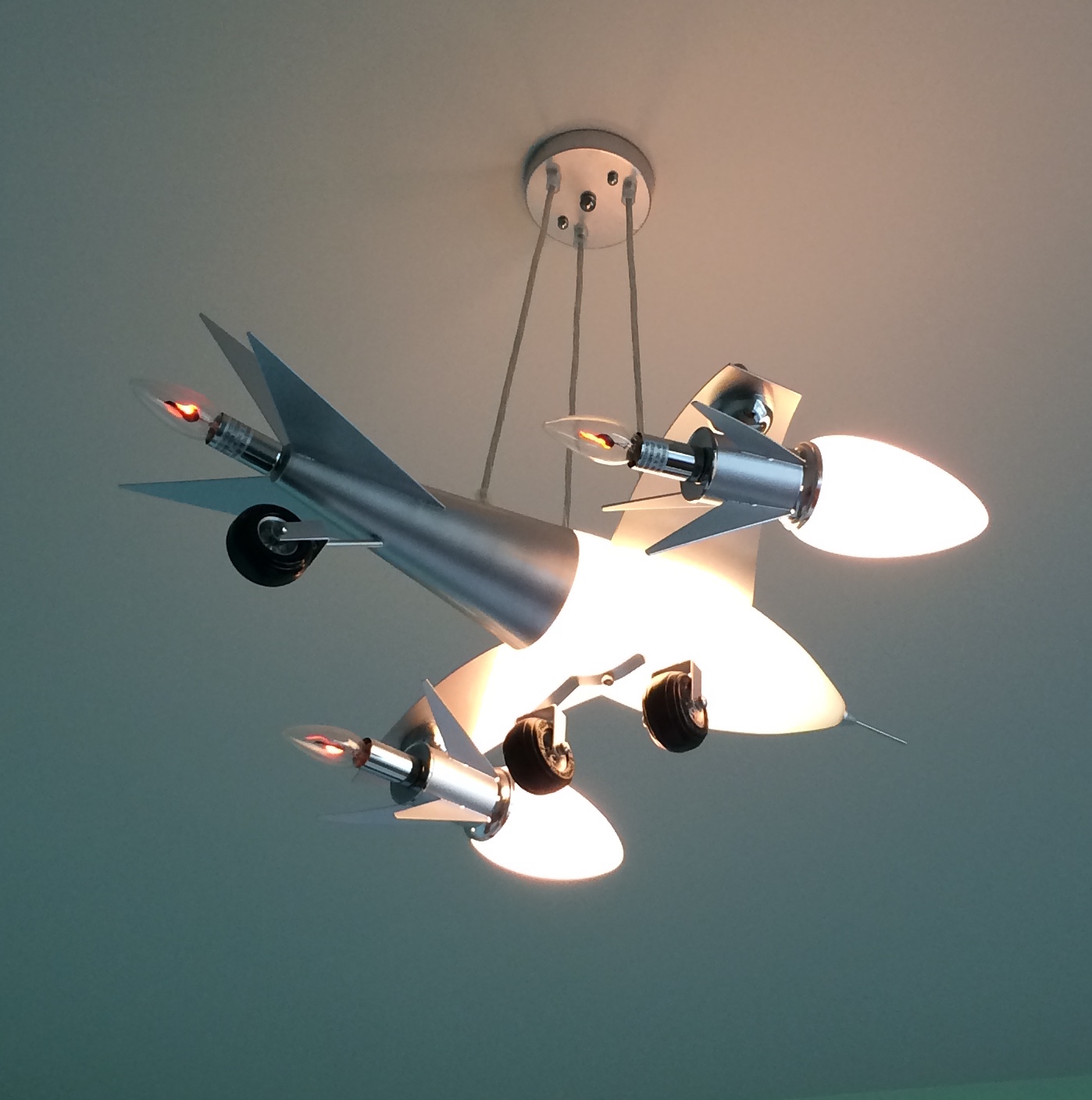
As we went through the rest of the house, we quickly realized that our clients have quirky taste in lighting too, and the best of the best was their son's bedroom ceiling fixture!
If you want to see this thing's real magic, visit Gary's Instagram page: https://www.instagram.com/p/BJUCgBShuGc/?taken-by=captcampbell
We had a lot of fun photographing this project of ours and seeing it so loved by its owners. And we learned an important lesson about playfulness with interiors: don't shy away from colour!
Garage Slab
Progress continues on our Bridgeland House. Just the other day the garage slab was poured. It may seem like a basic thing, but it was more complex than it looks. Our neighbours' grade became higher than expected during their redevelopment. To avoid the possibility of their drainage collecting in our backyard, we wanted to raise our rear grade as high as possible. The grade of the back lane is fixed though, so any change in grade had to be transitioned over the garage apron and slab. But of course no-one wants to have a steep slope in their garage. The team at Rusch Projects were able to twist the apron just enough to raise the slab and therefore the backyard grade.
Framing Complete
We were on site at our Bridgeland House yesterday for a final framing review and had a chance to see the framers load the basement stair. While it's not something you think about much when living in a house, it's a significant component that takes a lot of effort to load and install. However, we think the steel and timber stair that goes to the upper floor will be even more work.
Compliments to Rusch Projects and their framing team for an excellent framing job!
Framing Progress
Progress continues on the Bridgeland House! The garage is framed, the basement slab is ready to be poured, and the second floor is getting framed. Gary Campbell took these shots for us.
Crane
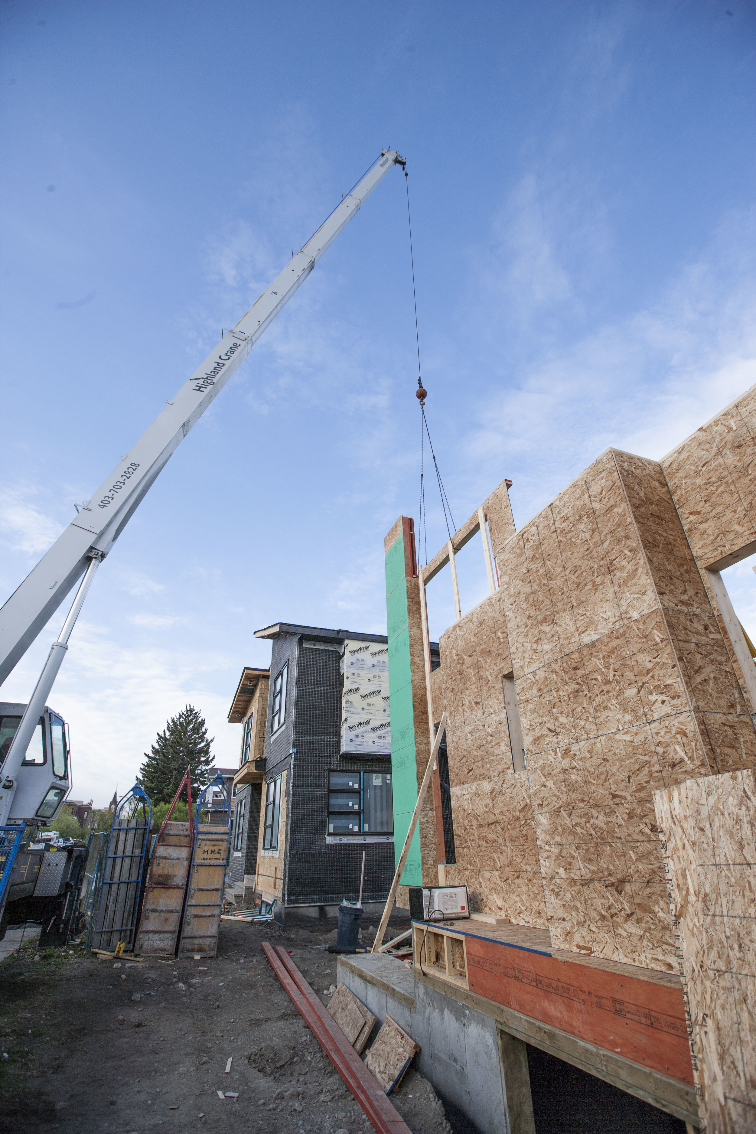
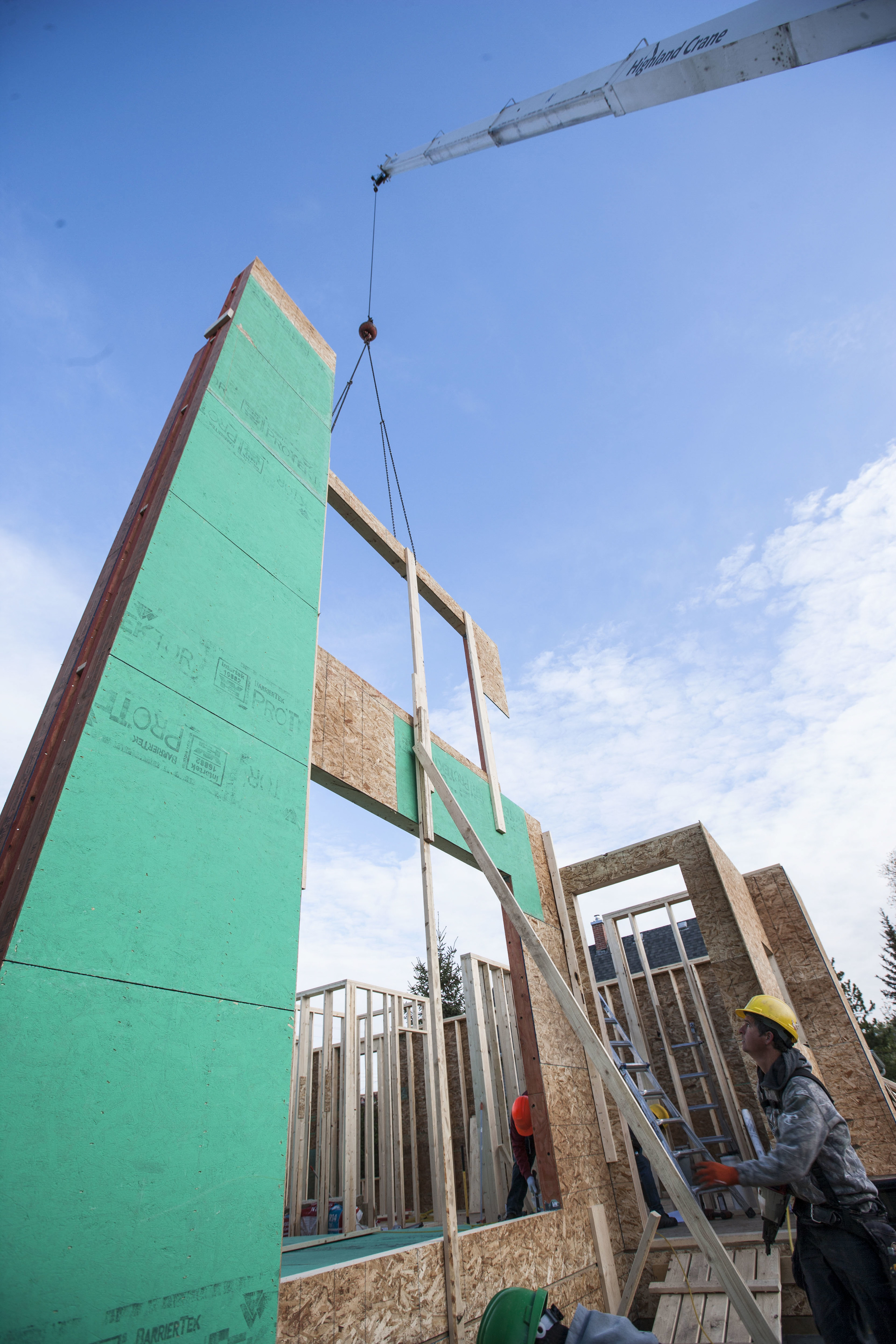
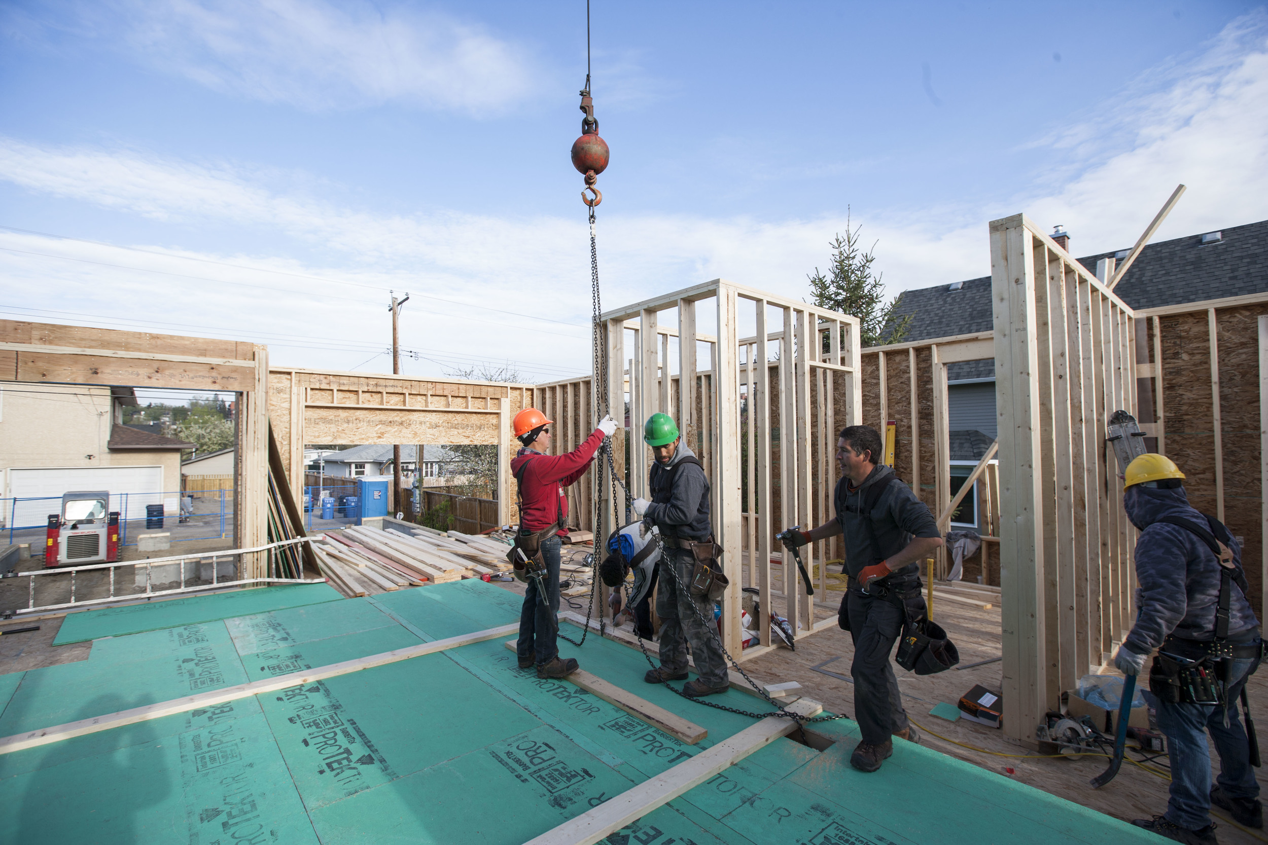
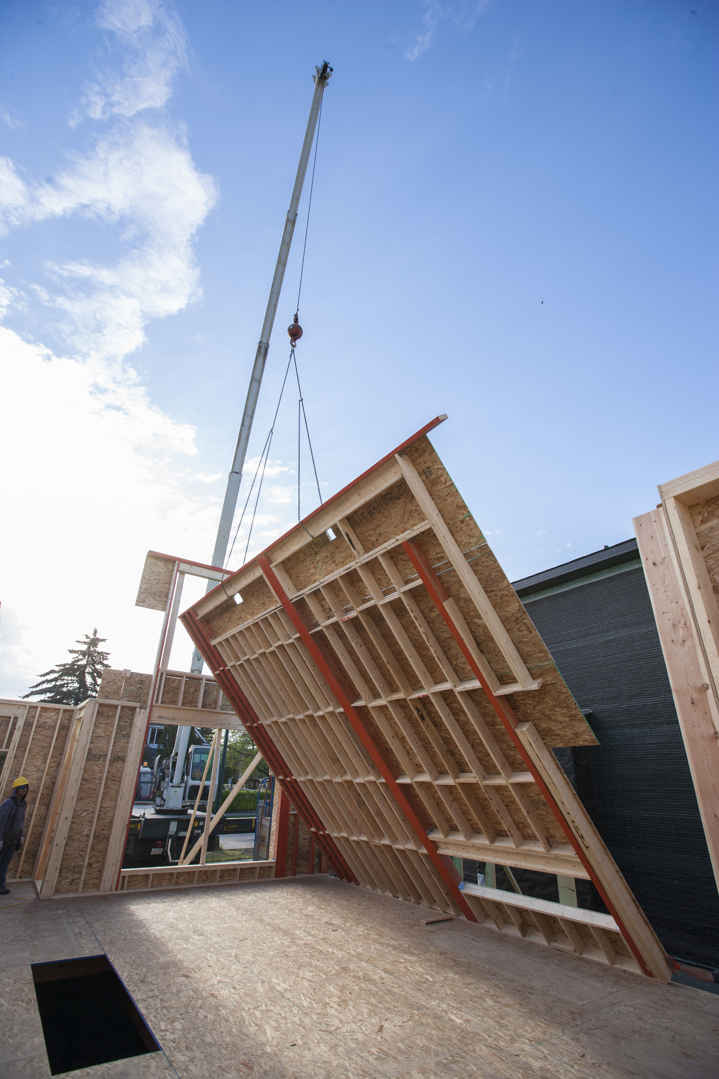
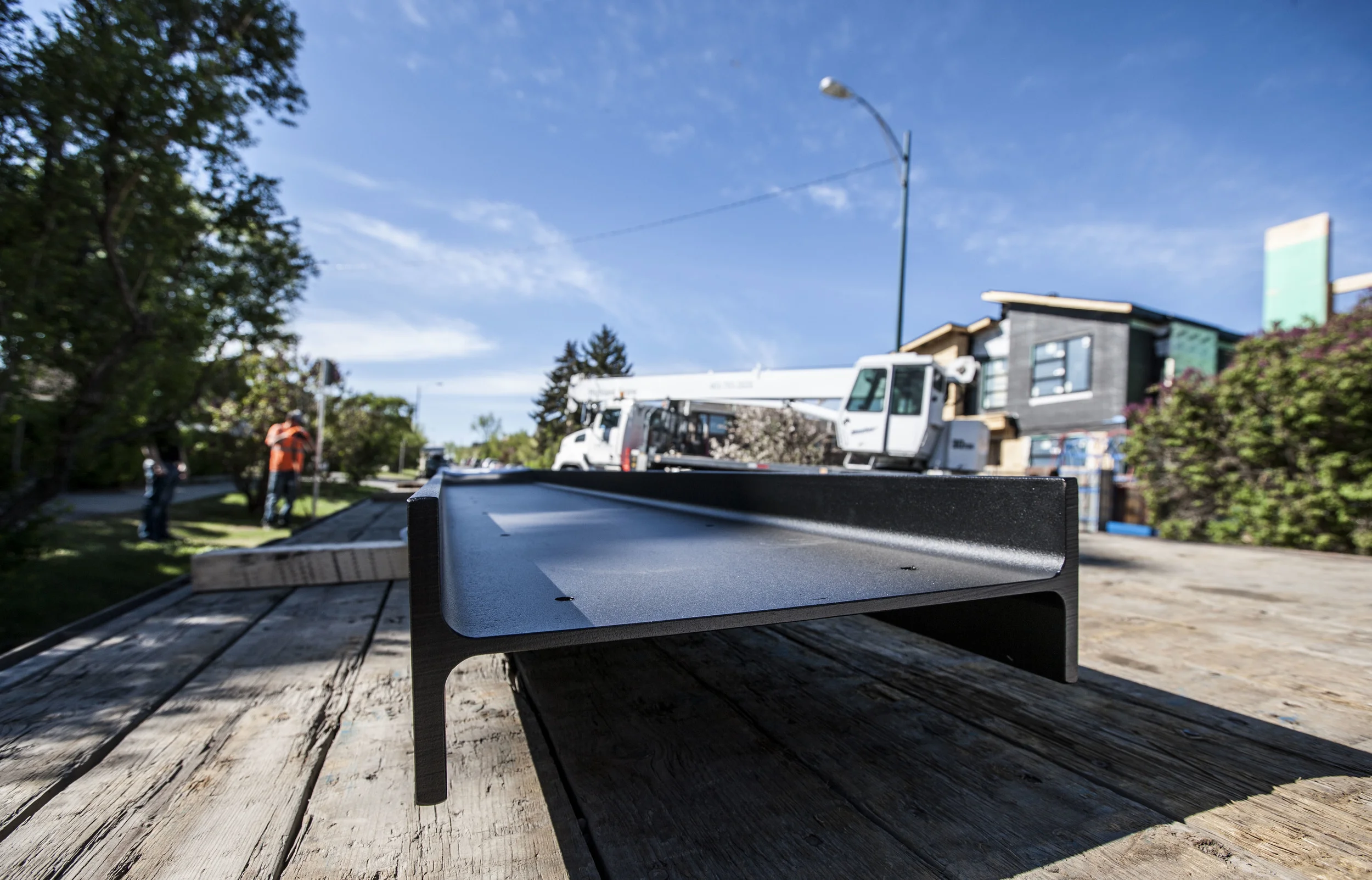
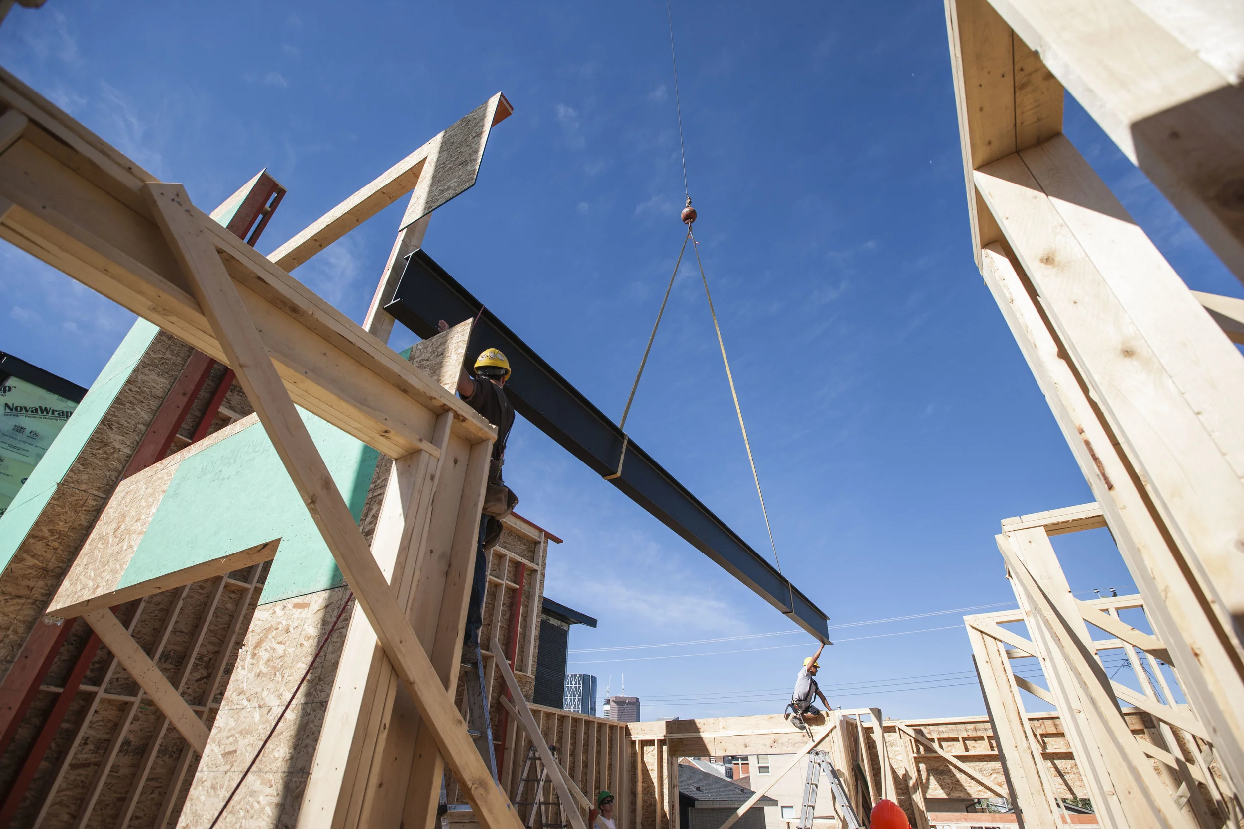
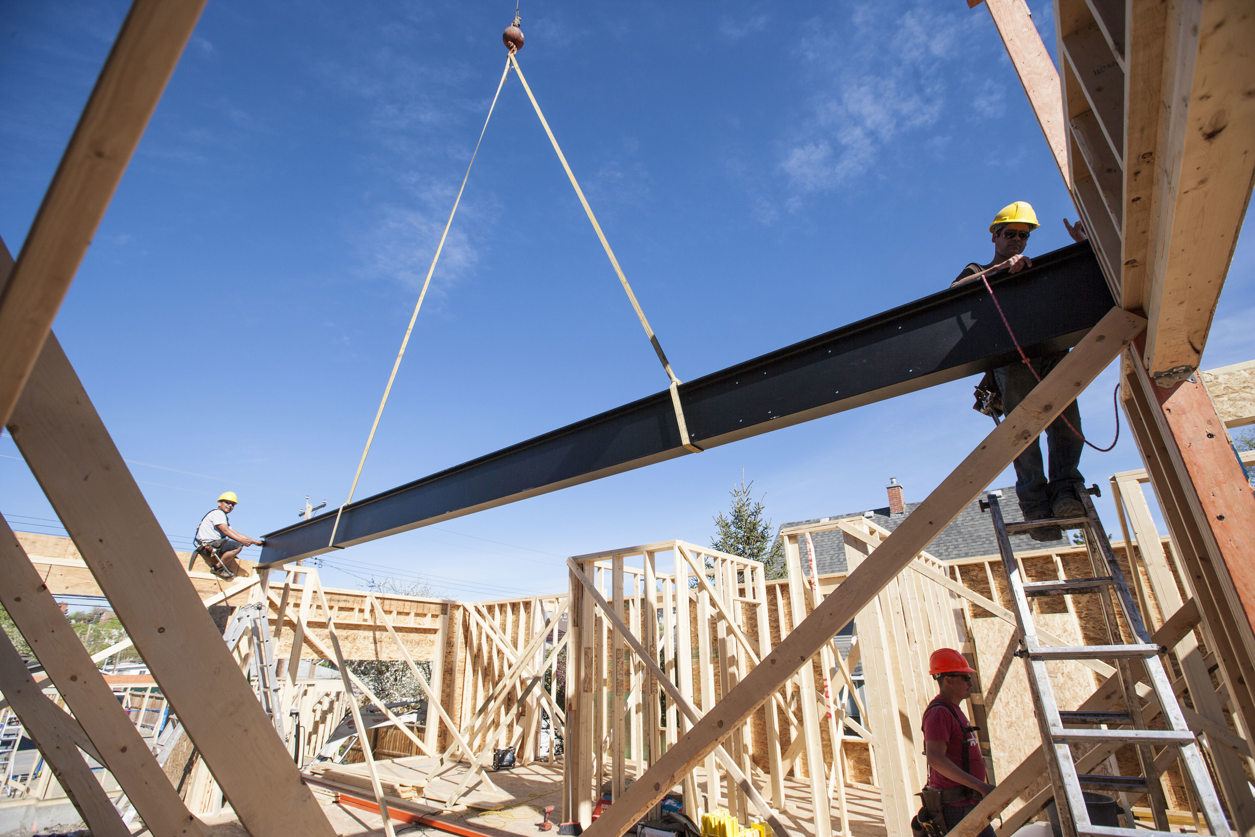
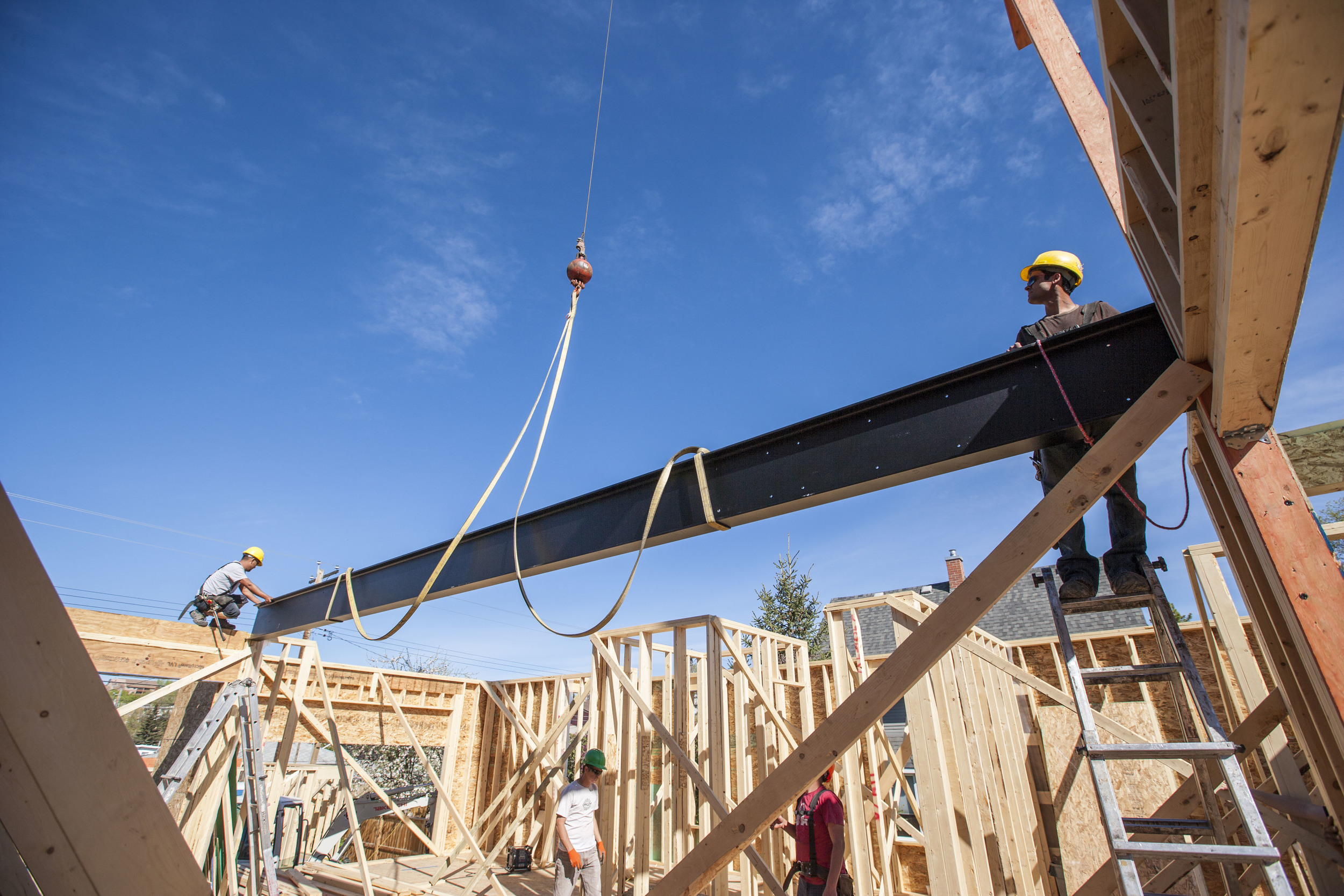
Last Friday the tall walls were craned into position on the Bridgeland House. Then, just yesterday the crane came back to place the steel beam. This beam supports the upper floor so that the main floor is completely free of posts. But the real reason the beam is there is to show itself off. The beam will be exposed at the stair which will also be made using matching steel stringers.
Gary Campbell took all of these photos. When he first sent them, we thought we'd curate the best. But they make such a great slide show, we've included them all!
Framing Starts
Building Permit in hand, Rusch Projects has started framing the Bridgeland House. These guys sure make framing look like fun!
Thanks to Gary Campbell for the photos.
Foundation
Over the last week, our Bridgeland House has had it's foundation poured. The following shots show the formwork in place, the pumper truck pouring the foundation, the stripped foundation, and the main floor plate almost complete. Thanks to Gary Campbell for the photos!
Footings
Hot on the heels of our last post on the subject, Rusch has poured footings and is standing up the forms for the foundation walls. Things are moving forward!
Just an aside, it's great to see keyways in the footings. They're always on the drawings but almost never done in the field. Funny because they're meant to keep the earth from pushing the bottom of the foundation wall into the basement.
Excavation
If you've been following this blog, you may recall an entry on the demolition of an old house in Bridgeland.
Much has been accomplished since then. The Development Permit was approved and the construction drawings have been prepared. The owners, Gary and Heidi, have selected Rusch Projects as their builder and they have in turn applied for the Building Permit. Partial permit in hand, Rusch has fenced and excavated the site and will soon lay out out the cribbing for the footings.


